For me, figure collecting is about paying homage. If I like a character from a certain anime/manga/game well enough, I’ll try to get myself a tangible piece of it, often in the form of models, figures and toys. I sometimes buy DVDs/BDs as well, but between gawking at a thin spine of a DVD case and an intricate figure, my preference naturally leans toward the latter. This is partly why I’m so picky with the figures I buy. The figure may be well-sculpted and painted, but without a reason to be fond of the character itself, chances are I won’t end up buying it.
Thus, given this personal policy, it’s rather strange of me to pick of Good Smile Company’s Dead Master (Original ver.) as one of the only PVC figures I purchased in 2010. After all, as an original illustration by Huke, there’s no real story behind the character whatsoever. Whereas the better-known Black Rock Shooter character inspired a popular song by the doujin group Supercell, Dead Master remained solely in the realm of illustrations. Going by her horns, clawed hands, painful-looking scythe, and floating skull companions, you can gather that she’s a probably up to no good, but what else is there to know about her?
It could be worse though, since having no story at all is at least better than having a shitty story. I mean, what if Good Smile Company decided it would be a good idea to fund an hour-long OVA and dump a truckload of sleep-inducing slice-of-life moments over an absolute trite plot with a couple of dry, emotionless fight scenes stuck into it? That sure would be awful, wouldn’t it? I’m glad that no such thing exists so I can enjoy this figure for what it is – a gorgeous rendition of a gorgeous character, pretty enough for me to cast my usual pickiness to the wind and leave not a single hint of regret.
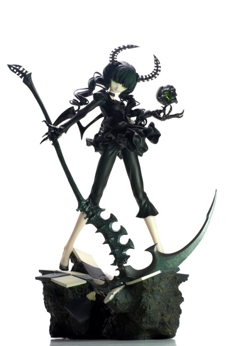
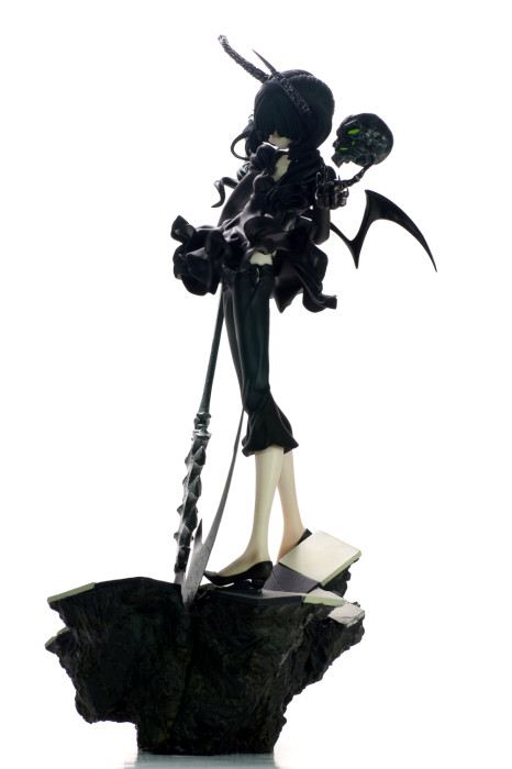
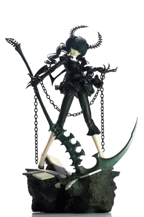
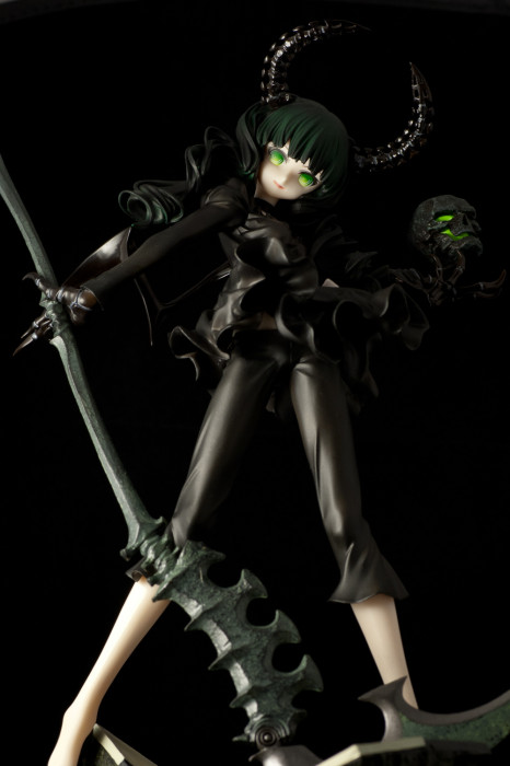
For a 1/8th scale figure, Dead Master boasts an impressive height of 27 cm. Although some of that is attributed to her brick of a display base, the figure itself is no slouch. The bulk of her head and the length of her legs put this figure on the higher end of the 1/8th scale. Considering the fact that GSC is asking 9,800 yen for her, this generosity in size only makes sense.
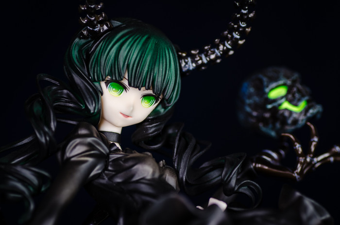
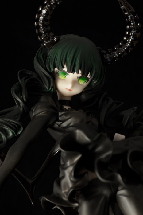
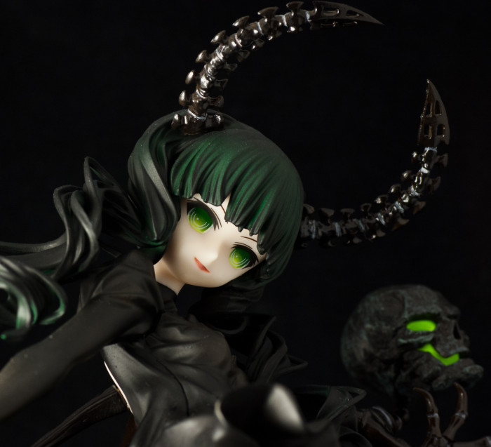
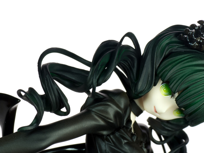
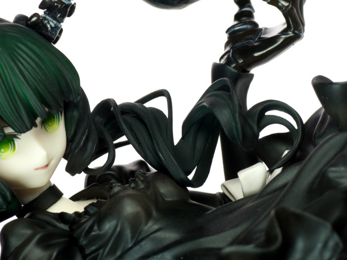
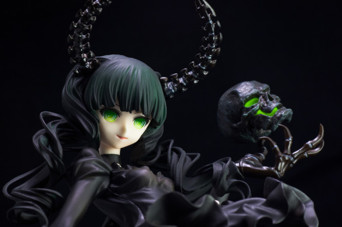
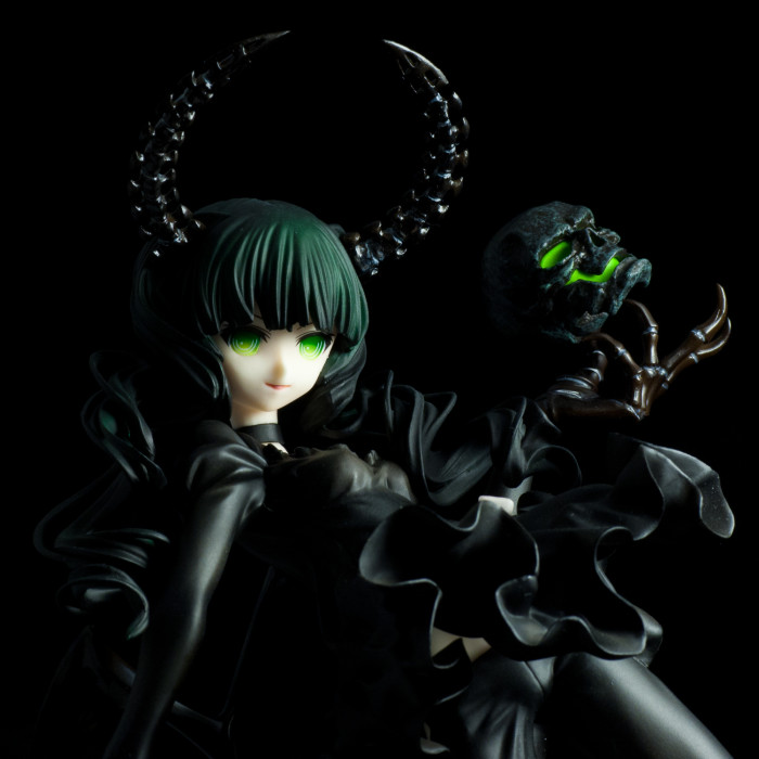
As Huke’s art has never been known for rich character expressions, the GSC Dead Master’s close adherence to Huke’s art style is similarly lacking in emotion. If eyes are the windows to the soul, then Dead Master’s eyes must be a pair of very dusty windows, because I can’t derive much from looking at them. Normally I’d put this as a con, but in Dead Master’s case, the lack of expression gives the figure a profoundly eerie feel, especially under the right lighting conditions. The gradient effect on the eyes makes them seem as if they are glowing, which makes them very striking. Dead Master is kind of like a creepy doll – a pretty little thing, but there’s some inhuman quality that makes her unsettling. The pale face and that smile of hers are the icing on an eerie cake. I’m not sure if that sort of cake would be to your tastes, but I eat it up.
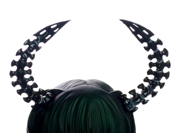
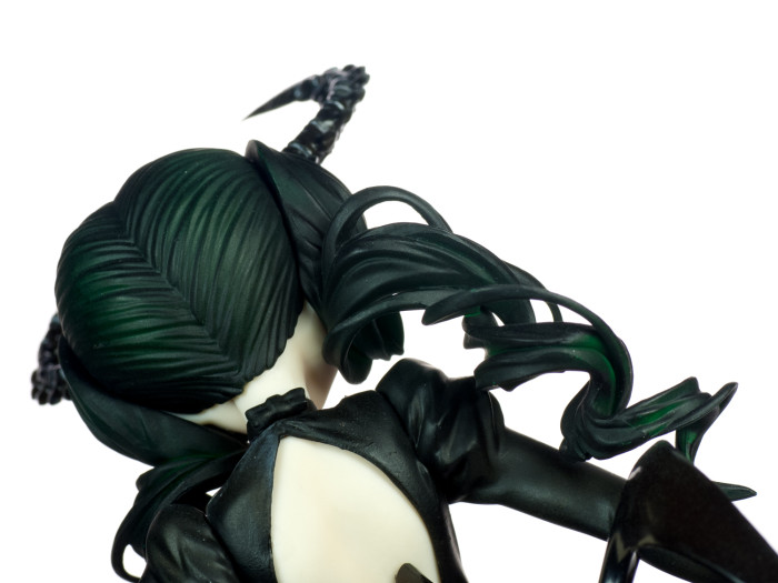
The spine-like horns are coated with a glossy finish. They may look very fragile, but thankfully they are made of a flexible material, so they won’t snap like a twig should you accidently bump them.
Dead Master’s hairstyle is somewhat of a mystery. Although she has neat straight bangs, a pair of curly twin tails seems spout out of nowhere from behind the horns. The sculpt for the curls is very intricate and the moulding is sharp. When compared with the original promo photos, the hair on the final version looks significantly less green than before. While I think her looks fine the way it is, I also think that the added contrast from a stronger green tint would improve the figure’s overall appearance. Not a big deal to me, but it’s worth keeping in mind.
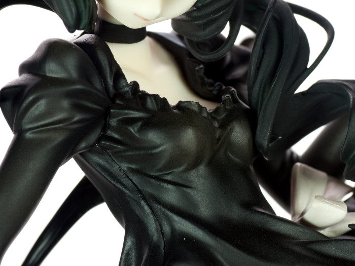
For a scythe-wielding crazy lady, Dead Master has a very classy fashion sense…or so it seems! The body portion of the dress is made of a softer, more flexible material than the pants and the arms, and it does a great job at showing off the impressive amount of sculpt detail put into it, as the innumerable folds on the dress are clearly visible. Unfortunately, there is a seam line running down the side of Dead Master’s dress. It’s more or less bearable from a normal viewing distance, as the dark colour context around it makes it less conspicuous, but it really stands out from up close (and especially under a macro lens). The dress still looks very nice overall. The upper half hugs her body tightly, highlighting her modest pair of assets, while the flared out lower half conceals her long midsection.
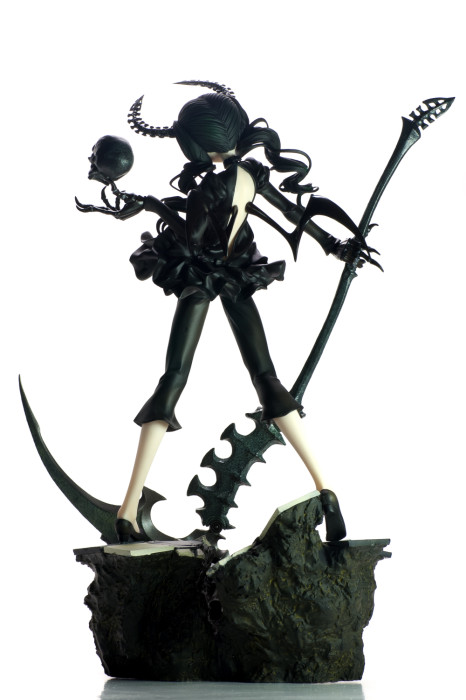
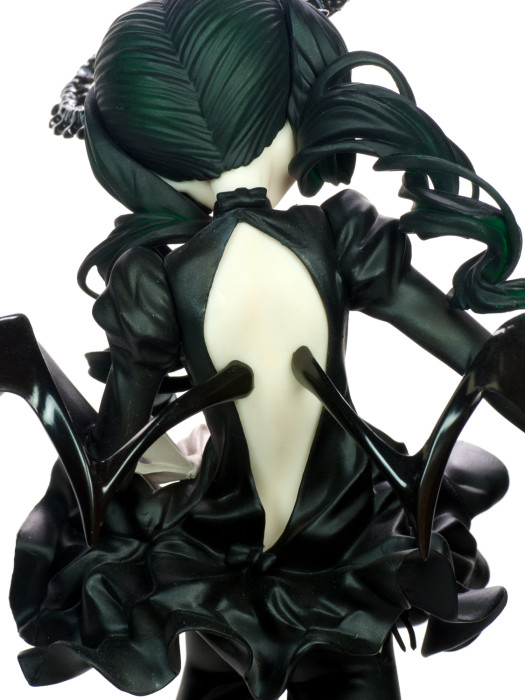
Dead Master’s dress may appear quaint from the front, but the back view reveals a much more daring look. There is virtually no back on her dress, and the slit almost runs down to her bum. Two pointy wings stick out of her pale back. There are made of hard plastic, and inserting them into her back was a very tricky business. I was afraid of breaking the brittle-looking things, and only found success after loosening her holes by running some hot water over her back. You just thought of something dirty, didn’t you?
In my mind, I associate flared capris pants with bourgeois women. This association is not rooted in any knowledge of the dressing habits of rich chicks; instead, I just assume so because I can’t imagine poor people wearing that sort of thing. Combined with Dead Master’s crazy curls, the capris pants contribute to establishing the ojou-sama look of the character.
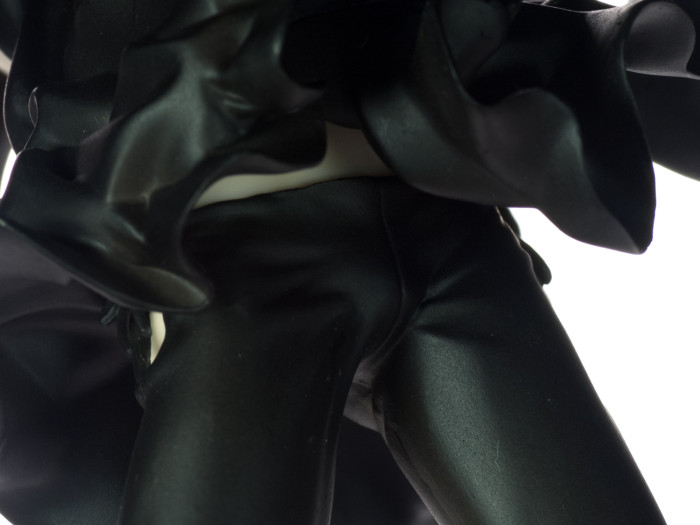
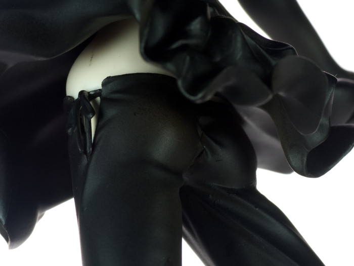
But when you take a peek under the hood, you’ll notice that the capris pants are barely held up by strings, with no evidence of any other garments underneath whatsoever. Considering how tight these pants are hugging her ripe peaches, I can’t help but to imagine her being very uncomfortable…which is kind of hot in its own right. When viewed from the front and her left side, you can make out gaps between the ruffles of the dress and the low rim of the pants through which her pasty white flesh is visible. There is a scuff mark up the upper left hip of my Dead Master, but thankfully it is pretty out of the way.
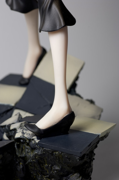
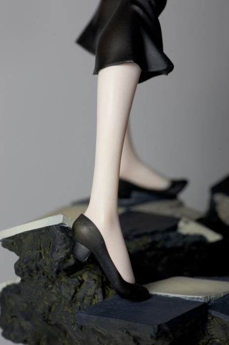
There are some minor seam lines on the sides of her feet, but they’re nothing to make a fuss over. I did however notice that the lower legs have a more prominent sheen than her face and back.
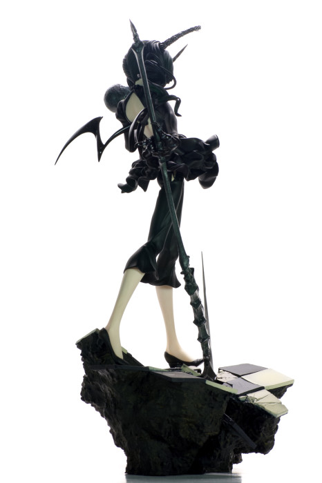
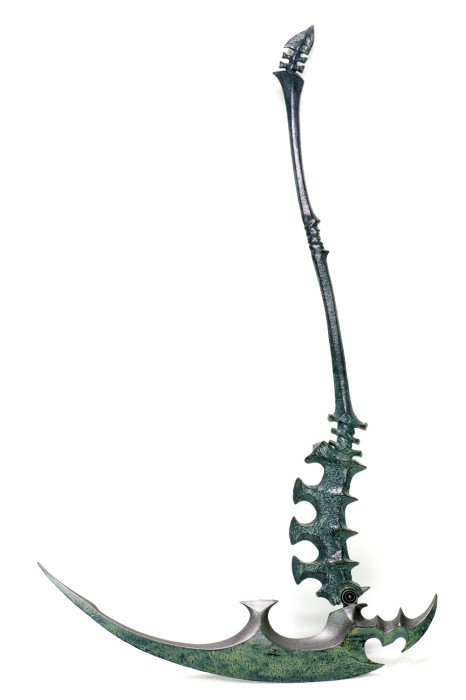
Dead Master’s big mean scythe contrasts strongly against the character’s skinny little girl image, thus making it a big focal point of this figure. Fortunately, GSC pulled out all the stops for it. Upon first beholding it, I had to run my fingers over it a couple of times just to be sure it isn’t actually made of metal. Most of the scythe is covered by an oxidized texture, but the business parts of it (i.e. the edge) is shiny and smooth, thus emphasizing its deadly nature.
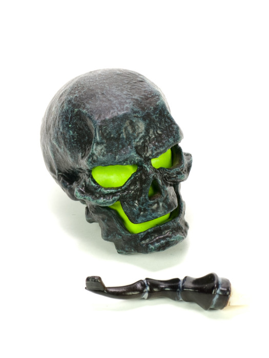
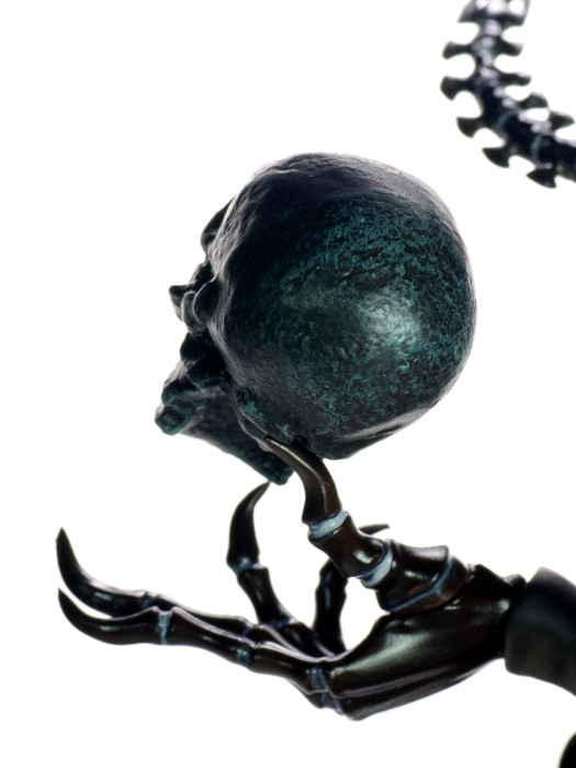
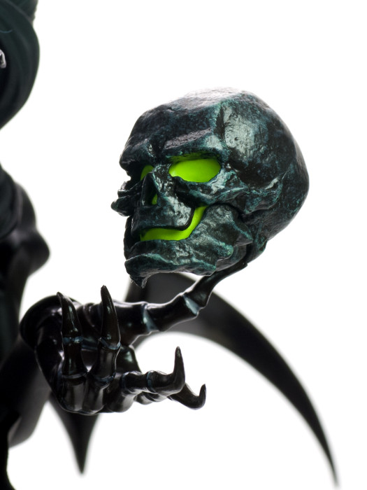
The floating skull is attached to the hand through a swappable thumb, which has a little tab at the end that is inserted into the back of the skull. For such a small accessory, it is admirably detailed with a stone-like texture. It would’ve been cool if the green core is painted with luminescent paint, but that’s just me being greedy.
The hands themselves are given a glossy finish. The fingertips are awfully pointy. I wonder if Dead Master can shlick with those talons. Maybe that’s why she’s so evil? Imagine if your fingers are made of razor blades. Yeah. I know I’d get cranky if I can’t scratch an itch.
An alternate tab-less hand is included for use in conjunction with the chain. I have a feeling that the chain was added as an afterthought, but it isn’t an unwelcome addition. It is made of metal, so its heft ensures that gravity would do its job when the chain is hung been Dead Master’s two hands.
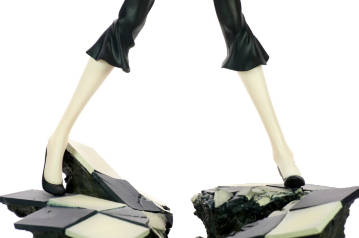
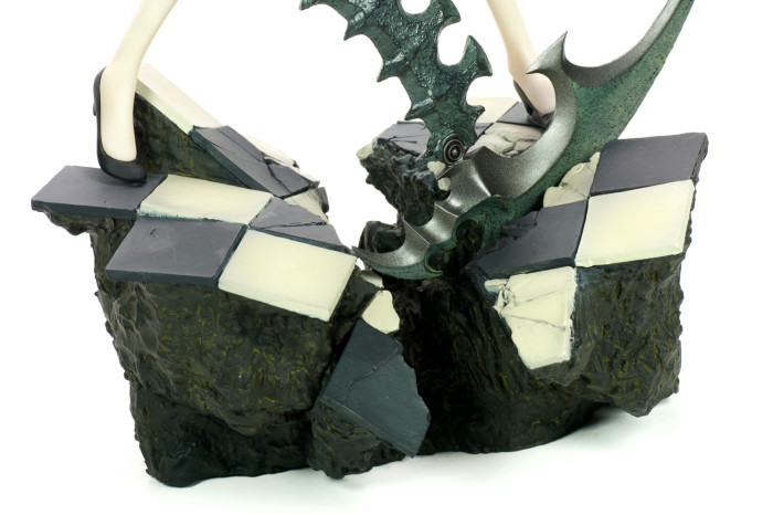
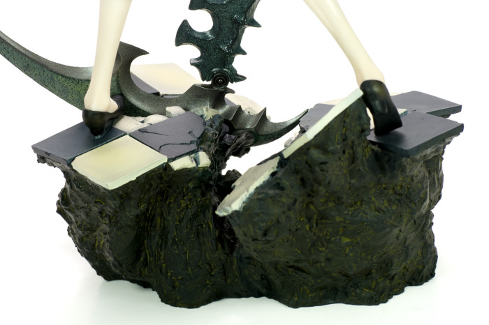
The base depicts what’s left of a once handsome section of marble flooring. The foundations underneath kind of look like mud rather than concrete, which might suggest how it ended up in its current state. I like the base a lot. Although it’s pretty bulky, its size is not enough to steal attention away from the figure itself. Rather, the added elevation the base provides serves as a good platform to compliment Dead Master’s downward gaze. As the figure cannot stand without the base, its inoffensive appearance is something to be grateful for.
Final Say
I bought Dead Master for looks and looks alone, and in that respect Good Smile Company certainly delivered. The flaws on it are minor, and there are plenty of splendid details from the horns above her head to the rubble beneath her feet. But that greatest strength of the 1/8 Dead Master (Original ver.) is its ability to instill an atmosphere. The way she is poised high over the rubble she made with her deadly tool while the seemingly glowing eyes on her deathly pale face gaze downward gives her the image that befits her name. There is power in her slender frame, and you can tell that she means business just by looking at her – the sort of business that would not be pleasant to whomever she may be staring at. To arouse such a collection of feelings and sensations speaks a lot in the figure’s favour, and I’d highly recommend the figure to anyone who would be interested in a chilling touch in their collection.
Like other recent high-profile GSC PVC releases, Dead Master is finding herself in the bargain bins of some Japanese retailers. At the time of this writing, Amazon.co.jp has her at a whopping 41% off. If you are able to take advantage of such deals, I would tell you to pounce on it like a cheetah if it at all appeals to you. I wouldn’t count on the usual suspects (Hobby Search, Amiami and HLJ) to axe their prices, as they did not do so for the other GSC figures, so if she looks like your cup of tea, it’d probably be a good idea to act sooner rather than later.
Pros
- Pretty yet deliciously creepy face
- Eyes seem like they’re glowing
- Intricate sculpt for the dress, horns and hair
- Superb textures on the scythe and skull
- Healthy size for a 1/8 scale figure
Cons
- Seam line running down the side of the dress
- Hair is noticeably less green than the promo photos suggest





42 replies on “Review: 1/8 Dead Master (Original ver.)”
Everytime I look at her all I can think is “This is what a anime character designed by Giger would look like”. >_>
Sure would be nice if these gals had a real story…Game looks interesting atleast…
Ooo, I can see it! Although if Giger had a hand in Dead Master’s design, I bet he wouldn’t have stopped at the hands and the horns — Dead Master would definitely have a tail at the very least, fufu.
I’ve always felt that the BRS characters would work best as manifestations of some sort (like persona), so when I saw some of the screenshots for the BRS game, I was a little confused. The presence of burly SWAT-looking gunmen suggest the story is going to take place in the real world, but on the other hand, BRS is is wearing a jetpack, and jetpacks make everything better. In any case, I’m looking forward to the game — God knows my PSP has been collecting dust lately.
Thats what STR is for…Can’t blow all your tricks on one character! :p
But yea the game looks rather zany, but in a good way…I mean if your gonna do something at least do it with gusto I say! Fail or not at least you’ll remember it which is more then I can say for the tepid OVA…
I enjoy this figure, I was pretty happy when mine showed up back in early December, looking forward to having the BRS to go with her arrive this Monday too 🙂
I never realised you had a collecting policy in regards to content that the figures came from! If I did that I’d have so very little stuff 😛
Haha, I think that policy is the only thing that stands between me and total destitution.
+1
Man, a policy would be great to have. But I find it extremely difficult to get myself to stop liking anything and everything.
It seems the more you look at all the little details on these huke designs, the more fetishy and sexual they get. Not that I’m complaining.
You’re sounding like Yotsuba thar =)
I can’t nail down the exact fetishes that Huke is tickling, but whatever he’s doing, it must be working! Huke’s done pretty well for himself to join the likes of Yamashita Shunya, Range Murata and Tony Taka. Garnering enough interest in an original illustration to warrant a figure must be a pretty spiffy accomplishment.
Bit of constructive criticism… you need to work on your white balance I think. All the white background pictures appear to have a greenish tint to them, a problem I suffered with for a while until figuring out the proper white balance settings for my particular lights. If you print out a sheet of paper with 18% grey or have a camera bag with a grey interior it’s likely close enough to help you set your white balance presets*. Otherwise the dark background shots look great! The header shot and this shot are the best I think in terms of exposure and lighting.
I still haven’t taken my Dead Master out of her box, nor BRS (Anime Ver.) for that matter. I’m way behind…
And to chime in on Ash’s comment a bit… If H.R. Geiger did Dead Master, there’d be something really sexual about her posture, or accessories, or the base etc… have you seen his artwork? It’s both enormously creepy and disturbingly erotic, which just makes it even more creepy.
*Note: I didn’t originally fix mine this way, I sampled the background of my shots with the white balance tool in Adobe Lightroom until it looked right to my eye, then later corrected when I found out better methods. I was pretty close doing it by eye, perhaps it can work for you as well.
Thanks for the criticism, Aka! To be honest, I’ve been scratching my head at the white balance. These photos are actually the product after a number tweaks, and I used many of your suggested methods as well. Initially these shots were even greener than they are now, but when I tweaked the temperature too much, everything started to look yellow (in fact, I still think of of these look too yellow). I’m going to hop back onto camera raw and see if I can find an optimal level.
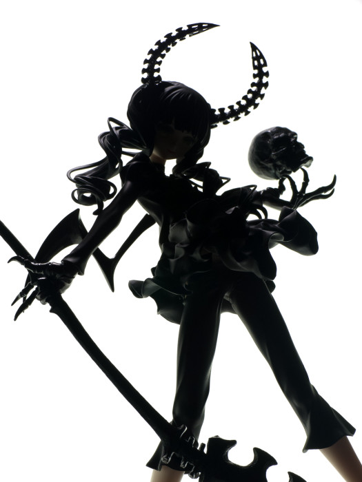
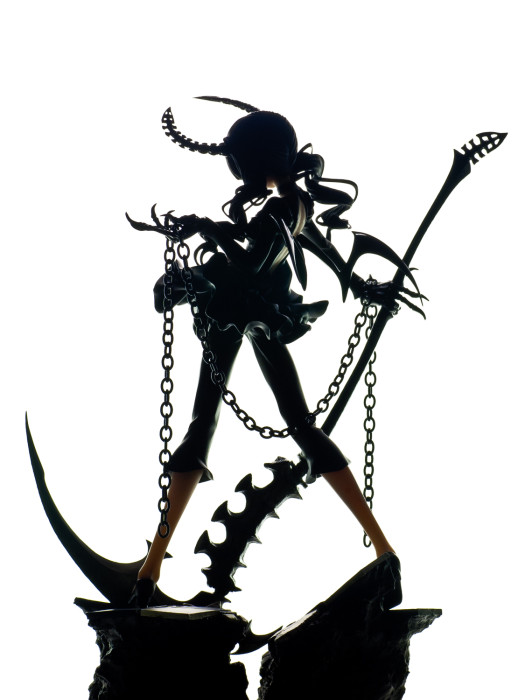
Those two you mentioned are my favourites as well! I also like the last silhouette shot quite a bit, especially the way the edges seem to glow. Thank you again for your studio post — I may have botched it up a bit along the way, but it was still a very fun experience!
When adjusting the white balance are you only given a temperature slider? or a tint slider as well? I tend not to rely on adjusting these unless I want a certain effect though. I like using the white balance eyedropper tool if available, as I can try and pick out an area in the photo that should be the most neutral in colour. That will of course adjust the temperature and tint automatically based on whatever area I choose to be ‘neutral’.
The only thing I’ve found more annoying than white balance is colour profiles on monitors and in photoshop. Comparitively I think white balance is easy now, and even just investing in a simple grey card and shooting that before each set would help out considerably.
One tool I might recommend looking into and mentioned in my studio post, Lightroom. It makes batch processing simple, so once you’ve found your white balance presets, you can import and have the white balance auto-applied. Not sure how your work flow is, but the batch processing aspect of Lightroom simplifies so much for sets of photos.
I used to use the grey card to set the white balance present, but I’ve switched to using this contraption my dad made. It’s a white mesh stretched over one end of an hollow cylinder. I put it over the lens and point the camera towards the lit subject and set the preset that way. It works like a charm most of the times, but sometimes it’s; a little off. Maybe the overexposed background had something to do with it (just a guess)? In an case, yeah, I’ll use the card in the future to make sure I have a reliable neutral colour to fall back to.
Adobe Camera Raw has all the features you mentioned. It does have a colour dropper and a tint bar, and I can save adjustment to presets (or just apply adjustments to multiple photos at once). I first used the dropper a few times to get something that seems close, then used the temperature/tint bars to touch it up. But it seems that after a while of staring at the screen, I start to lose track of what’s good and what’s not. I re-uploaded the white background shots last night. I thought they looked alright back then, but now I’m once again uncertain…do these look alright to you?
Oh you did? I was looking at them earlier today wondering if I’d been crazy because they looked a lot better than I remembered them being. I’m glad that this was not the case, I’m having issues sleeping and thought perhaps it was that getting hold of me.
I think they look fine now, the issue I had originally was her pale skin seemed to be green and sickly and now it appears to be mostly just pale like it should be (or at least like I think it should be, as mine’s still in box).
I’ve mostly used this shot as my reference since it has a good chunk of skin exposed, and it seems pretty good to me. However looking through I think these two shots (1, 2) stand out a bit as still having the issue and as I didn’t focus on them before I’m not sure how pronounced it used to be. Nor am I sure that they’re not supposed to have this green tint that I think I’m seeing. Is that green tint in the rock and tiles? If so then the effect in the shadow that I think I’m seeing is probably just my eyes in which case the shots are fine.
Whew, I’m glad they are more or less acceptable now. I’ve replaced these photos twice since I first posted the review, and reinserting all the images is a pretty tedious chore! ^^;
You aren’t mistaken — I’ve had some trouble with the base shots. For some reason the preset I used for the rest of the photos doesn’t look right on them, so I tried to adjust it a little. It’s either the dirt looked too yellow or the white parts look too green. I lost my patience after a while and threw them up as they were. I’ll probably have another crack at it soon.
I very much understand how replacing images can be a chore. I have yet to do it for all my previous reviews that have not been converted or fixed for the current wider layout. It’s such a tedious task to do for one post, I don’t want to do it for 67 (the reamining number I have to fix)
I think the two remaining shots can be left, everything looks good now, and they only stand out because I went back through and scanned for faults, comparing between my original test use shot of her back.
Good job fixing them, and I’m happy to hopefully not have come off as a pain pointing out flaws.
Not at all! I am glad you were there to point it out. In all likelihood, I would not have acted without someone telling me the photos looked off. Instead, I probably would end up staring the photos awkwardly in the weeks to come, wondering whether something is wrong with them or not. If I screw up again in the future, be sure to let me know! =)
We used to have his Artbook for sale at a Bookstore I worked at…Ofcourse noone ever bought the creepy thing, but it was interesting to flip through when I was bored with nothing else to do…….Gotta wonder how that mans mind works…scary…
Have you seen a picture of Geiger? He looks scary.
She’s so lovely to look at! I adore the creepy cute vibe I get from her although I still can’t put my finger on what exactly I find cute about her.
I really should come up with some kind of collection policy also.. but if I find a figure’s design attractive and it’s within our price range then I simply must have it or I’ll lust after it for god knows how long. I wish I didn’t find it so hard to move on, haha.
I really like how her eyes look all glowy this photo: http://www.flickr.com/photos/34366571@N06/5336014528/
I think it’d have to be my favourite angle to view her from too. 😀
Yeah, Dead Master is pretty cute. I’m partial to her outfit, which has a lot of feminine charm, but I also think the creepy doll effect works in her favour as well. For example, even though Blythe dolls still creep me out, I can see how they are cute in their own way.
I didn’t find TOO many angles to shoot this figures from, but I absolutely loved the couple that I did find. The first thing I did was to point the lamp up towards her face to bring out her eyes. But even without doing that, her eyes still have a glowing appearance, which is one my favourite things about this figure.
Looks like she’s about to snack on your SOUL!!!
>_>
I very seldom know anything about the characters whose figures I buy. Let’s look at my preorder list … Dizzy I know and love. Mai Shiranui I know and her exclusion from the last KOF game was the reason I didn’t buy it. I really suck at using her though, so whenever I play CvS2 I usually pick Iori or one of the shotokan dudes. I kinda know Junko Hattori though I stopped watching her anime for no major reason. However, it was really cute how she got bukkake’d and I like how she wears a braided thong under her school uniform so maybe I’ll pick it back up. Goto Matabei I sorta know but Hyakka Ryouran Samurai Girls is so damn bad I’m not that interested in learning more about her. And that’s about it. I don’t really watch a ton of anime so play a lot of video games so most of the rest of the figures I order I’m getting mainly because of looks.
Dead Master looks really nice on a white background. Back when I got the first BRS figure I didn’t want to photograph her on white because I wanted a gloomy, mysterious feel to match her look, but all the BRS figures seem to photograph well on white.
I wouldn’t bother with Hyakka if your in it to learn more about Matabei considering she has about zero development…Shame really. That and your nice SM queen becoming more and more ineffectual and slowly devolving to generic character status…yea I wouldn’t watch it. :p
I would watch Junkos Anime because its quite awesome…bit of a wreck, but awesome nonetheless!
I mainly had clarity in mind when I decided to shoot her against white. Also, ever since I read Aka’s studio post, I wanted to try his method out, and Dead Master seemed like the perfect opportunity. A darker backdrop definitely suits her feel more, though. I fantasized about throwing a bunch of decaying flowers in the background to build mood, but that never took off.
T_T
You shoulda…I demand props!!! >_>
Hey, where am I going to find a bundle of rotting roses in the dead of winter? Am I to call random florists and ask whether or not they sell near-dead flowers? =P
I don’t particularly care if the character has no background, if the figure is nice and unique (and if I like it), I’ll most likely get it anyway. Then again, I’m not familiar with many of these characters’ backgrounds, so I guess that aspect of figure collecting is a null for me. =P
I like the photos, the green looks like it’s glowing, would’ve been cool if it was glow-in-the-dark or had green LEDs inside. But that’s probably not very feasible. Like Aka, my DM and BRS are still in their boxes, I doubt I’ll get any of their reviews up anytime soon. ^^’
I really need to visit this site more often, too bad my work blocks your site. I think the category was due to gaming or pornography. LMAO Usually when I get home and I kinda don’t want to touch a computer or surf the Internet anymore. Also one of the reasons why I’ve really slowed down my reviews lately. Booo… =(
Gaming/pornography? This is slander of the the highest degree! We at hobby hovel offer AAA family-friendly content! In fact, you should bring this up to your boss, because rants about plastic girls would make for enlightening water cooler conversation. The folks at your workplace are missing out ;P
I wonder if there are any professional photographer figure reviewers out there. I bet because they fiddle around with cameras for a living, the thought of spending their spare time shooting more photos would probably be repulsive to many of them. I wish I won’t eventually get sick of the computer and the internet because of work. What would I do without them? Go OUTSIDE? Pffft.
But hey, thank you for taking the time to visit! I hope you’ll recover from internet burnout, because I would love to see more over at Visual Fanfare =)
Well, I used to (and somewhat) still do some “professional photos” whatever that means – but honestly, I never called myself a professional photographer. I just don’t feel my pictures can be classified as such – I hate how a lot of people go out and buy a DSLR and instantly they think they are professional photographers. Just a peeve of mine I guess.
Remember years ago when we had that huge black out? That was nice, actually, no Internet, no TV, people were actually out on the neighbourhood street playing and *gasp* talking to each other!!
Well, my PSU is completely fried, so I’m in the process of getting it warrantied. I’ve started working on my reviews again starting with the long procrastinated Buddy review. Guess it’s God’s way of telling me to stop playing games and get back to semi-naked plastic girls.
Hooooray. ^_^’
Oh, and I forgot to mention, I’m able to get onto Tier’s site with no problems. I’m still shocked at how THAT site passes through the filter at our work while I run into problem with yours and sometimes Aka’s. LOL Heck, I was even blocked out of my own site sometimes – I was uploading an album of a car show I went to, and in my description I wrote “cold and wet”. Apparently our Internet filter at work doesn’t like the words “cold and wet”. It got blocked thinking it was pornography. LMAO How else was I going to describe a rainy 2 degree celcius day?
Ahhh, so these filters work based on keywords, eh? Hmmm, maybe one of my meta tags is tripping things up. I’m guessing “toy”? For a moment I thought there were people paid to scour through the internet blacklisting sites one by one. That would be such an absurd position. Good luck filtering out the millions of porn sites out there!
hehe. Now your top pics against white background look less green and more purple. Some of the white backgrounds even have masses of subtly purplish artifacts that look like ghostly flames. :p
And thanks for the shot of the setup. It was very informative for me. 🙂
But how are you lighting her from the front? You can see clearly that DM’s face is poorly lit when she’s against the black background when you compare the diffuse light only vs the cool low angle light on her face. 🙂
Anyway, these are lovely shots. 🙂
This review makes it clear to me that I was wrong and you were right regarding a point from the Meiling review. These last two statues dipict girls with freakishly long legs. O__o;
But Gundams also have the same issues, too. :p
I’ve already told you that I don’t like this one. But the details are superb, despite the mass production issues. And I like the accessories, too. I like the base, the scythe, and poor Yorick, too. It’s a beautiful toy for your collection. ^^
Purple? PURPLE? GARGH!!!! I give up. The quest for perfection would only drive me insane. I don’t know how accurate my monitor is, but I’ll take my chances with it for the sake of my sanity.
As for the lighting in the black background shots, there were a few variations.
http://www.flickr.com/photos/34366571@N06/5336023890/
For this shot, I only used the light on the right side.
http://www.flickr.com/photos/34366571@N06/5336025532/
http://www.flickr.com/photos/34366571@N06/5336024294/
For these shots, I used the top light in addition to the right light.
http://www.flickr.com/photos/34366571@N06/5336013816/
I forget exactly what I did for this shot, but I’m pretty sure I only used the lamp on the left pointing up. I think I also turned the figure towards the light so the lighting wouldn’t be s single-sided.
Really, when you only have a couple of lamps and a light box, it’s just a matter of trial and error. =)
I don’t know what’s with Japanese people and these long legs. Maybe it’s a cultural complex, because Japanese people tend to be short? Long legs are probably a universally desired trait in both genders. And when you have unlimited creativity to work with, the likes of Meiling, Dead Master and Katoki designed mobile suits are the inevitable results, no?
hehe. Well, I do love those K-On! girls and their short Japanese proportioned legs. :p
As I am an avid sports watcher, I know that there are all kinds of body proportions. And I know that people who have freakishly long legs compared to their body length do exist.
Still. Haha. It’s stupid, but now, looking at my growing Figma collection, I notice how much Tohsaka stands out with her freakishly long legs compared to the others. She started to bug me right after I got my Figma Mio and Azunyan. Am I being bothered the wrong way? Should I be more bothered by the short legs and long bodies of Mio and Azunyan? XD
Oh well. My Figma Aigis is still on the Pacific somewhere and I’m still going to get Figma Black Gold Saw with her ridiculous platform-boot-accentuated long legs. >.> Xd
Oh, I’m so stupid. I am trying to see whether drawing cartoon art would be something interesting and rewarding to do. Right now, I’m doing a sketch of Dead Master, but I couldn’t figure out what color to use to highlight her black clothes. I should have been studying your photos! XD
It looks like pairing a rich purple with a dull grayish greenish yellow might look pretty nice. 🙂
This is such an awesome figure. Nice photography too.
Thanks LoboDemon! =)
Wow Dude this comment system you are using is up to no good for me.Insane Loading times and then I had to log in with twitter because the others wouldnt work with me.
That aside I must say I out of the whole review I liked this part th best:
“Considering how tight these pants are hugging her ripe peaches, I can’t help but to imagine her being very uncomfortable…which is kind of hot in its own right.”
Ive gotten BRS for pretty much the same reason as you did with Dead Master but I dont get anything outta this girl nor that Black Gold Saw ( whos responsible for these names anyways ^^;)
Actually I liked about BRS the Scar part with stitching the most and in the end I was unhappy how GSC decided to make them look so fresh. Seems she just woke up in a tub and noticed that she lost some internal organs.
Prolly one of the things I like the most about Dead Master is the Green Eyes of the flying Skulls.I know they arent really glowing but lets say I can imagine how they glow from those dark caverns
Don’t worry your not the only one who has trouble with it…usually takes me 3 – 5 refreshes to finally make the dang comments load. 🙁
Oh my, I did not know about this comment problem. What browser are you using? Not that I can do much about it, since this is pretty much the only choice available to me that doesn’t suck TOO badly ^^;
The fantastic ass cancels out the terrible name, so it’s all good. I bet the word “mistress” is not even in Huke’s vocabulary. If I didn’t know any better, I’d think “Dead Master” refers to a rich dead white guy. But again, awesome ass is awesome; her pain is my gain. =)
Speaking of glowing, the skull on the top lid of Dead Master’s packaging glows in the dark! I remember waking up in the middle of the night and seeing a tiny glowing skull in the corner of my room. It freaked me out for a split second.
She is indeed pretty. I love her eyes, they are so hypnotic! And I have quite a fetish with characters that use scythes lol. The flying skulls looks great too. I normally don’t pay too much attention to figures. Aside from my two Hetalia One Coin sets, I don’t own any figure but DM is tempting me. The anime was pretty meh though so I agree with you about knowing/liking the character and just not for the prettyness of the figure but I’ll probably make an exception with her. Too bad I’ll probably get the figma because I’m pretty much broke 😛 but she has an amazing character design anyway.
i thought the ova was good!
Well, I guess its a matter of personal interest there…