Stupid storms…can’t shoot my bikini figures…….Oh hey there all! *ahem* Yes welcome, welcome! Today we will be ogling half-naked Rise be taking a look at the recently released Racing Miku by GSC!
Racing Miku is a rather odd creature. If you asked me to make a list of potential companies that would sponsor a race car, GSC wouldn’t be anywhere on there, and the fact that they picked Miku to be the face of their racing team is even more bizarre, but hey, I certainly won’t complain about more Miku!
This whole thing started with the original Miku racer car which was a BMW. Sadly I’ve heard the car did terribly so they swapped her out for a Porsche and changed the livery on it while they were at it. Instead of the serviceable but not terribly exciting Kei art they commissioned Redjuice to do some absolutely spectacular images for the car using an appropriate racing theme that the earlier one lacked!
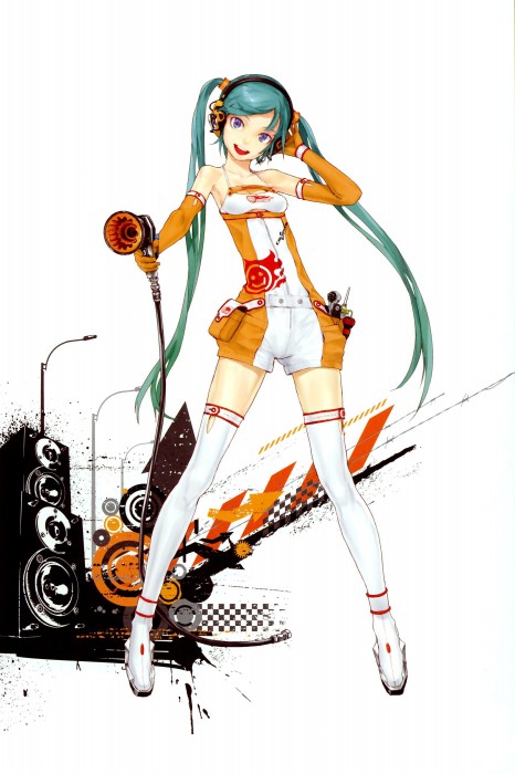
The design for the stickers for the Porsche actually went through three different incarnations. The 1st and 2nd used the look that this figure portrays with the third and final version using new Redjuice illustrations with Miku sporting a modified Race Queen version of her original mechanic outfit. Sadly, GSC made very little merchandise for the final design, as as luck would have it, that design is my favorite. Anyways, I enjoy the look of the illustrations so much I actually went out and bought a few sheets of stickers of them and slapped em all over my bike…ah yea, I’m hopeless.
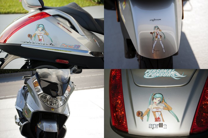
In any case, the point is I love Redjuice’s art and I absolutely love the look of the 2010 car. They’ve since made another racing Miku version for 2011 while swapping back to a BMW, but I couldn’t give a damn about that one as this version is more to my tastes.
So without further ado let’s get this thing rolling!
For this review, I’m going to deviate from my usual format. The reason is that even before this figure was released a lot of people were gripping about certain aspects of her (read: all of them) so I’m going to try to address these one at a time starting from her head and working our way down!
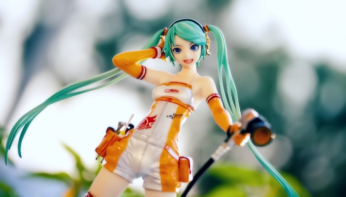
“WHY DOESN’T HER FACE LOOK LIKE THE PROTOTYPE!!!”
Well, after extensive research of staring at the figure and the box shots for fifteen whole minutes I can conclusively say: her face looks exactly the same. If you think it looks different from the promo shots well that’s probably because it’s a different angle.
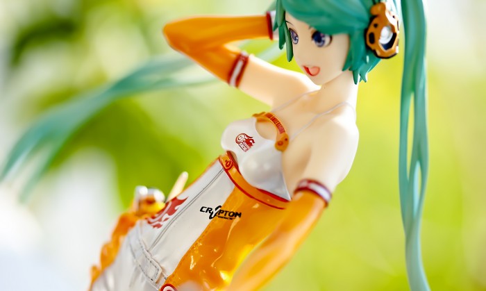
“Why are her boobs small and saggy?!?”
Her breasts are indeed small and “saggy”, and I love them just the way they are! Seriously, don’t they look like the perfect pair to cup with your hands? Mmmmmm…
…Ahem, anyhow, Miku’s breasts look exactly the same as those in the original the illustration so if you don’t like it them, chances are you aren’t a fan of the the illustration either, which begs the question: what do you care? Fun fact: women can actually have breasts shaped like this. Shocking, I know!
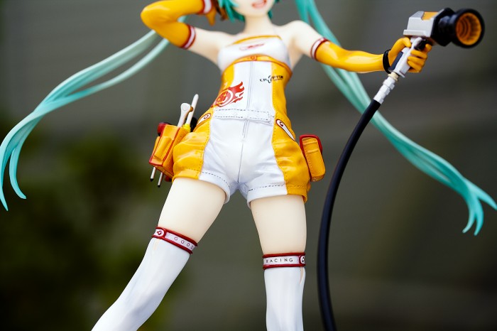
“SHE HAS A PENIS!!!”
As much as I’d be delighted to find a fun little prize in those pants, Miku is in fact not a futa. Yes, the clothes bunch up in an odd way at the front to make Miku look like she’s smuggling a tool of a different kind down there, but unless you sit and stare at her crotch for hours on end (a tempting proposition, I might add) you aren’t going to notice it. And once again, this is something that’s present in the illustration.
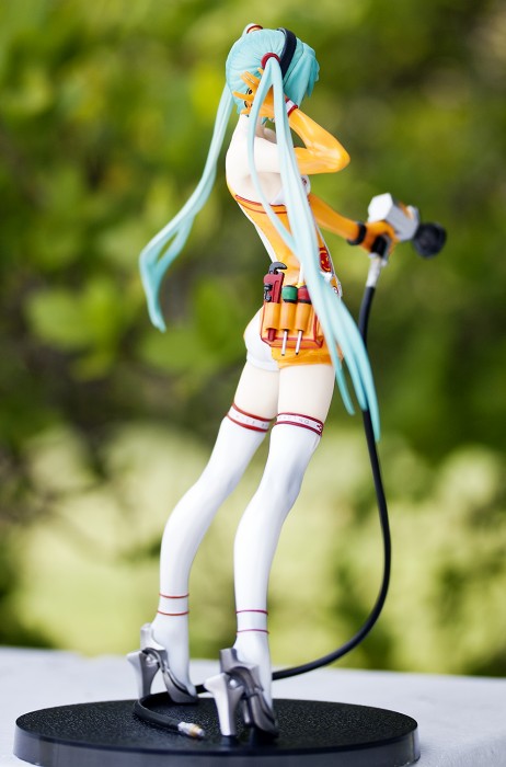
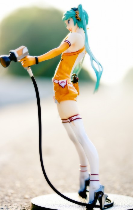
“What the hell, she leans like crazy!!!”
I won’t lie — she leans more than goddamn Pisa. The photos you’ve seen here and other places aren’t deceiving you in that fact, and it’s probably my only real issue with her. I don’t quite know how the decision-making went for one. “Yes, what Miku needs is to look like MJ doing a Zero G lean!” But for whatever the reason, it looks pretty daft from the side and back.
From the front though? Eh, it’s tolerable. Setting her on my desk conveniently places her gaze right on my crotch…hmmm ok,  maybe this is one of those your mileage may vary kind of changes. The fact that her base is a hollow cheap piece of junk also doesn’t help with her wobbling all over at  the slightest tremor. In any case I highly doubt she’ll actually lean…errr…further, but it still looks silly.
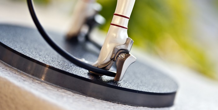
“Why does she have those weird shoes?!?”
Redjuice likes his crazy techno heels. Deal with it!
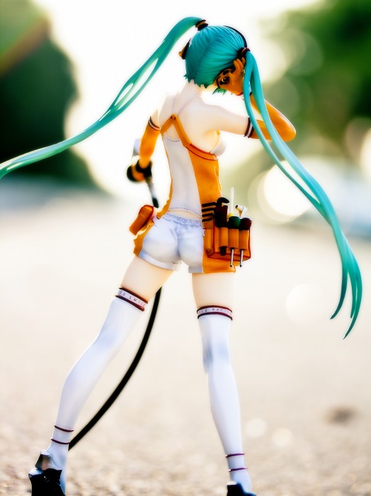
Now that I’m done answering questions, what do I personally think about her? Well, I kind of like her but sadly I don’t love her as I thought I would. Kind of how you see a girl from behind and you think “Daaaamn” and then she turns around and you think “Damn…”. The crazy lean and the general appearance of the figure gives off is a whole different feeling then what I was imagining.
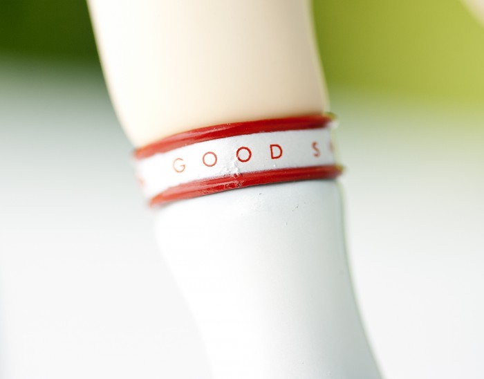
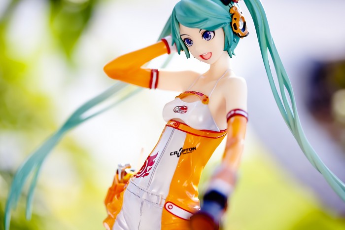
It’s not all bad, though! This is a GSC figure and the craftsmanship on her is near-perfect. Save for a few minor paint hiccups she’s  beautifully painted with that glossy look GSC seems to use for everything whether it’s appropriate or not lately. She also has a very lovely upper body sculpt with thin little shoulders, a nice collarbone, and those delicious little breasts.
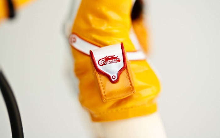
Her legs are nice even if they are posed awkwardly and she has a splendid bum. You also got all her little accessory bits crafted down to the finest detail so no real complaints from me on that front.
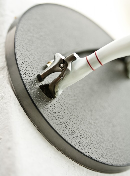
It would be nice if the base wasn’t so god awfully boring though. Maybe it’s supposed to be asphalt, but would it really have been so hard for GSC to give her a white/orange base and slap a GSR logo on it? GSC passing up a free advertising opportunity like this seems unthinkable — if you’re gonna whore yourselves out, at least go the full nine yards!
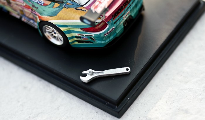
One last rather random thing of note is the wrench she comes with. In the original promo images this tool was in her little side pouch thing, but when you get her it’s been packaged separately while the rest of her tools are a fixed part of her side bag. So you might be like me and think “Ok, maybe it fits inside the bag somehow then?” Ehhhh nooope! So basically you have this tiny little wrench that serves no purpose whatsoever other than to be eventually lost…eh?? It’s just such a random stupid decision by GSC I honestly cannot divine the meaning of it at all.
“Hey GSC I have this random loose packaged wrench here…why is that?”
“Felt like it.”
“…..I…see…Well in the promos it fit in her tool pouch didn’t it?”
“Yep”
“And it doesn’t now?”
“Nope”
“And the reason because is…”
“To fuck with you.”
“Good to know!”
Pros
- Excellent quality both in paint and sculpt
- Delicious detailing in the body sculpt and small details
Con
- LEANING TOWER HOOOOOO!!!
- Crap base is crap
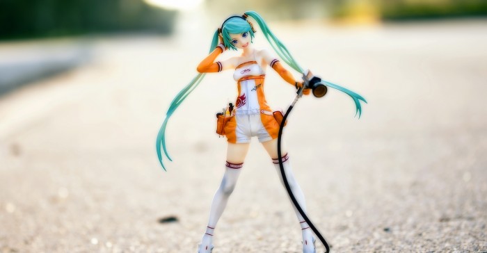
So there we have it. Good Smile Racing Miku is not perfect, but the quality is still pretty damn good, and if you like the colors orange and white with some blatant advertising for effect, she’s worth the money! Just make sure to put her on a higher shelf so you can admire her bulge face.
Honestly, now that I have her in my hands I’m not that incredibly enthusiastic about her. She’s a great realization of the original illustration (sans the whole awkward leaning thing, of course.), but the fact that I see that illustration every day on my own bike it feels like I’ve had this figure for much longer than a few days. This is not really GSC’s fault but I still think the third version of the Porsche stickers would have made a far better figure then this. Oh well.
Hopefully that was bearable…I actually originally wrote this when I was in a rather foul mood (as you can probably tell) and I was going to delete it, but I thought hey why not have some fun with it…and…yea…
By the way, shooting by the side of the road is awesome! You almost get hit by cars and bikes and people mistake you for a dead person!



23 replies on “Review: 1/8 Hatsune Miku (2010 Race Queen ver.)”
Nice pictures! Brave brave man for lying out in the road taking pictures although it seems passerby were nice enough from your tweet. And maybe its the blur but damn, your street looks pristine.
The sculpt, details, paint, and shading looks top-notch on this figure and I normally love redjuice’s art but… I don’t really care for this Miku. Part of it was the small saggy boobs, saggy is OK but the outfit makes it look weird and a large part of it is lack of curves and hair. The art looks OK but in figure form, I dunno, a bit boring. The 2010 final version Miku looks good and I really like the 2011 version (although I hope they change the pose if they do a scaled figure). After seeing your pictures though I would really like to see this one in person sometime to marvel at the craftsmanship.
Btw, your link to 2011 Miku is broken
Meh I was gonna shoot at a parking lot, but I figured what the hell just use a bike lane…Haha yea it is because of the blur well that and the fact that I picked a nice stretch of road…Just up the intersection from there you have dead palm tree leaves and crap all over the sidewalk and bike lane!
Yea GSC really put their heart into this I just wish they hadn’t made her lean like an idiot…Haha no-one likes the boobs! Fine I’ll keep em all to myself!
That’s what I get for copy pasting like 4 video links in…Oh well I’ve been informed by my trusty assistant the links have already been fixed!
Race Miku seems to be an interesting figure, the hyper face expression of her looks so funny and also really cute ^^. I love her detailed outfit with these many pockets and also the chosen colors. The only part I dislike is the saggy bikini top like thing, it should have been better connected with her suit, ok it looks like in the illustration, but even there it doesn’t look nice to me, it makes her boobs look saggy even though they aren’t saggy.
Mmh a castoff option would have been interesting I guess XD
But therefore I like the simple base which resembles the texture of a raceway :p
Can you exchange the tool in her hand with the lonely wrench? otherwise it really doesn’t make much sense.
your pics look very nice and the linked videos were interesting, was it difficult to find them?
Haha she is different I’ll say that much.
T_T no love for the upper body.
No you can’t its far too small.
Nah it wasn’t too terribly hard…Actually quite a few vids of the cars on youtube!
Its been a while since I’ve read about any companies coming out with a leaning figure, I thought they all found ways to fix that by now. I remember hearing somewhere that the owner of GSC is really into cars, which is why GSR was started up, but I’m not sure if that’s true or not.
I can’t say I’m a fan of the original illustration, but GSC did a good job on the figure. You could use the wrench as an accesory for other figure reviews if it doesn’t fit in Miku’s pouch 🙂
I just also have to mention that you’re crazy, putting a figure on the road. If I did that, I could probably jump out of the way of any vehicles before they run me over, but I don’t think my figures have the same reflexes.
No this was done on purpose Nopy. Like she’s not leaning because its a flaw but GSC decided to make her that way for whatever reason…yea I have no clue haha. Well that would make sense…Cars seems like something a big boss would get into like an expensive hobby. :p
Haha yea…It probably fits in a figma’s hand if I had any of those.
Heh well I’ve been called many things, but sane isn’t one of them so I can’t blame you for thinking I’m a bit of a loon. :p
Redjuice is an awesome artist, but I don’t really like this design. Â I like the Racing Miku with the umbrella and the Racing Miku Append better.
Her boobs are actually realistic! Â That’s why they’re so boring!
What! Realistic being boring?!? To hell with you sir!
Random thought: when I look at Miku’s wheel-screw thing, I see a turbo-powered onacup.
Wow, I’m really surprised at how little love racing Miku is getting. Lean aside, I like her just fine, and I think her chest looks great the way it is. I especially like the little “window” between her bra and the orange jumper. One thing that bugs me slightly about the figure is her nose, which is virtually invisible in all of the shots I’ve seen of this figure. Figure noses are one of those things you don’t notice until it goes missing, which is sort of the case with this Miku. But on the plus side, I think the inconspicuous appearance of her nose gives her a child-like charm.
Btw, do you have a clean picture of the final 2010 Racing Miku? Danbooru yields no results =(
What…..no wait I don’t want to think about it. Moving on…
Haha finally someone who likes that aspect of her! Ah you know I honestly didn’t even notice it until you said that…Mmm guess  it just doesn’t bother me.
Actually no I don’t, which makes me sad…I should try looking around again for it!
That leaning scares me, to think it was intentional.
I like this figure, it’s orange, I like orange. Plus is Miku wearing something out of the norm, I don’t mind Miku figures only that she usually is wearing her vocaloid outfit. Which is why I find this figure appealing, both the outfit and face are done stylistically reflecting the original art.
I wanna take pictures on the side of the road now but I would melt along with the figure on the pavement and what not. Still just like my friend says, the sun is magical, provides really nice lighting.
Yea the first time I set her on the base I was like….”Ummm ok I know she looked kinda leaning in some shots, but what the hell is this!”. >_<
Orange is a nice color especially paired with white! Heh they do like to stick to the standard look a lot.
Haha yea the sun hitting the asphalt can do some crazy stuff. :p
I think I’ve been fairly unenthused about Miku the entire time. I’m happy that she’s not a grid babe and instead sort of part of the pit crew, it seems sexier to me. A girl who can do a little work on a car and looks great while doing it is far more awesome than a girl who can stand in front of a car and hold a sign. It’s pretty much this reason I’ve bought this figure, joins two passions of mine, anime figures and car racing. But beyond that she’s far from my favourite Miku figure.
I think I would have preferred the artist of the newest Miku incarnation on their latest BMW to rework Redjuices Miku into something a bit more my tastes. Entirely removing the heels as well, I’ve always liked her boots, they’ve got a hell but it’s not obnoxious and keeping with that would be much appreciated.
As for the bulge, I will always just imagine she’s wearing a cup for protection in the pits. Despite her apparent lack of protection elsewhere.
True wrench wenches are a lot hotter then some air heads floating around as eye candy. She still feels like a race queen for me though with the complete lack of grim on her and all…Not that I think any maker would ever make a girl all dirty with grease and what have you as much as I’d like them to. :p
Can’t say it’s my favourite Miku, but definitely one I was looking forward to. Like Aka, this figure brings together two of my hobbies, which is great. I was really hoping to have received her before the Canada Post strike, but I didn’t. Then the lockout came, and well, shit. Who knows when my Miku will show up. lol =(
I liked your format where you addressed the concerns people had, it was an interesting read – I didn’t pay that much attention to what people say about the figure, I just know I liked it and that’s all it mattered. As for the small sagging breast thing, I think figure collectors are overly spoiled with unrealistic watermelon sized breasts that defy gravity. Miku’s always had what seemed like A or B sized breasts. =P I was hoping they would make a figure based on the design on the Porsche as well, but ah well.
Poor lonely wrench – it needs an umbrella. A race queen without an umbrella?! Unthinkable!!! ^_^’
Ah yea heard about that from Aka and Chags…Hope they get it all sorted out for yall soon!
Haha well after you’ve written so damn many reviews you just feel like you need a change and there was just sooo many complaints about the figure as soon as she was announced I figured I’d have some fun with it.
Yea when people say stuff like hating her breasts because they look “weird” I just facepalm…Reality is un-realistic right? Haha…
Indeed I really REALLY wish we could get a fig of that second design since she has such a delicious mid-section!
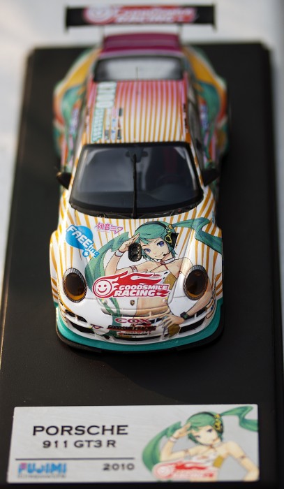
Yea I still can’t figure that out for the life of me…I have seen some people with it in her pouch but then the other tools are glued into it in a different position then mine? Really bizarre…Oh well it’s chilling out inside the case with my model car I took a shot of in this review so it won’t get lost.
I guess most people don’t care much for reality when it comes to anime girls. I’ve always been an ass person, so I don’t care much for breast sizes. LOLÂ
Maybe GSC came out with different batches of the Miku – wouldn’t surprise me if they did. =P
As both a big Redjuice and Miku fan, I’m a bit surprised that I wasn’t all over this figure! The craftmanship is obviously very high and I don’t really have any issues with the design but she just doesn’t do anything for me. I’m sorry, Miku! T_T
Her boobs look fine to me, it’s even a bit refreshing to not see those balloon type breasts hanging off her chest as with so many other figures. That crotch though.. that I did not notice until I read your review! I can’t not see it when I look at this figure now.. damn you, Ash! 😛
Great review, as usual! Your photos show her off well and the lighting looks wonderful. The soft glow your set gives off looks really good!
Yea I can understand that…I mean she looks really great, but for some reason I just can’t get excited about her…Very annoying feeling. >_<
Yay ally! Someone else who can appreciate a different then normal breast shape! Haha that's not my fault! Everyone kept complaining about it amazed you hadn't read about that before now.
Hah amazed you wouldn't be tired of it…Feel like I've done nothing but whore that look since I got the new cam. Ah well I'll shot some more interesting looking stuff when I get a fig that actually inspires me eh. :p
Ooh, I love her shoes! Very chic. ^ ^ I like her colors and pose, but… Probably not something I’d go out of my way for. Not sure why. Gorgeous photos, as always though!
Yea I love the shoes as well…Couldn’t understand why people said they where silly. T_T
Yea that seems to be the consensus of everyone about her myself included heh.
[…] new takes on the Vocaloid mascot, casting her as a sort of warrior clad in robotic armor and as a pit crew worker. Even more conventional takes on the character, such as Good Smile Company’s Lat-type figure […]
[…] The original design was done by Yuichi Murakami, a popular illustrator and has a futuristic and sexy look. I really dig the extensive use of transparent bits and in a figure, I have to admit, I’m a sucker for that gimmick as well. This is the second iteration of a custom Racing Miku design, you can see the 2010 version in Ashlotte’s review here. […]