Well, the rain may have let up, but the clouds still linger. so y’all are gonna have to bear with Alter’s Masou Shizuka this time instead of Menace!
I’ve actually had this figure for a long time now, but I struggled with how to photograph her in a way that would do justice to her bright color scheme… Don’t know if I succeeded here, but hopefully it’s ok (I feel like I’ve gotten woefully rusty in my skill lately… Lack of motivation?).
Masou here is quite the old gal. She debuted in the AliceSoft eroge Rance II waaay back in 1990 (Yes, twenty years ago. Suddenly, I’m feeling old…) and has since showed up in a few more installments in the series, including the most recent Sengoku Rance.
Despite her early origins, Masou is still quite an interesting character even by today’s anime standards. She was a tsundere long before the term had even made its way into the otaku lexicon and its certainly not a stretch to call her one of the first of her kind.
For her part she’s about 95% tsun, but when you realize that the male lead of the rance games is a shameless womanizer and a serial rapist, you can kind of understand why she leans so heavily on the tsun side of the scale. When you consider the fact that she’s just about the only girl that Rance can’t win over completely, she seems more like the only sane person in a game franchise full of loons.
As if her outfit does not make clear enough, Masou is a mage – an especially powerful one, at that. At one point her power overtook the limitations of her body so she restrains herself these days, but she still packs a punch and is easily one of the best units in whatever respective game she’s present in.
Now then lets take a gander at our green haired lovely here, shall we?
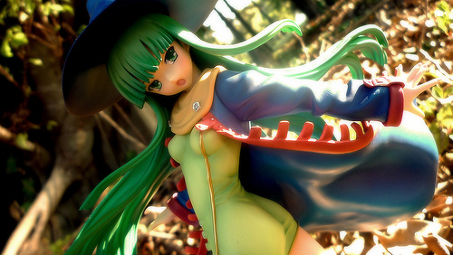
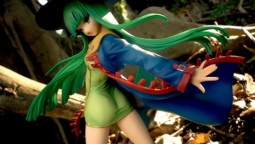
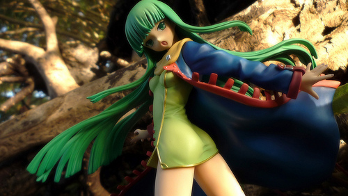
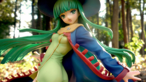
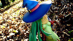
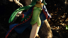
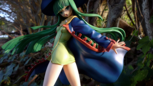
It’s been quite sometime since I last reviewed an Alter figure, but they do stunning work as always it would seem. On first glance her pose is just incredible in all regards…She has this slightly surprised look as her body elegantly twists itself around.
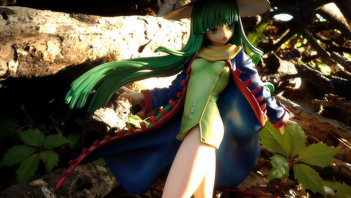
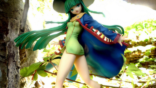
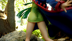
The fact that she’s twisting gives you a glorious view of her body. While the angle does make her butt slightly flatter (As it realistically should mind you), the qipao-like green dress clings onto every curve on her body. Indeed, it is almost feels like an extension of her body making her look nude in a sense. Everything from her modest breasts to her navel to her cute butt are all sculpted in complete detail despite the cloth covering them – a very enticing effect for sure!
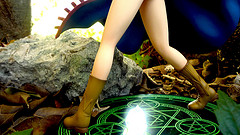
I would have liked maybe a little more definition to her legs though as they are a large focal point of the figure. Sadly there’s not much anatomical definition here to speak of. They have the proper general shape of course, but the lack of any detail in her knees (back or front) and thighs is a little disappointing.
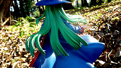
The rest of her outfit and her hair is extremely lovely in its reproduction of her original character design. They follow the simplistic look they had while adding a great deal of flair in the way they flow and move with her pose. It all gives her a very organic feel of something alive instead of being forced.
Her cute surprised face really pulls it all together and really sells the whole “scene” the figure is trying to set. Her hat uses a magnet to securely hold it in place. I always felt more figures should use this technique, so I’m glad to find it here.
Moving onto the paintwork: a lot of beautiful shading detail was lavished on her midsection to bring out all those curves, while the rest of the figure is relatively negleted, which feels a little awkward. Her outfit is supposed to be simple in appearance so I can’t really knock her for lack of detailed shading, but then why just only do it to her dress?
It seems odd to be so faithful in some areas and not in others. I suppose maybe they didn’t think they could make her sexy enough if they used the same rather basic painting method as rest of her dress or something? That might very well be true, but it still bugs me slightly…
True to Alter’s reputation, there are no real errors in the paint work. There are a few spots that look slightly iffy under a macro lens if you really wanted to find something to bitch about, but realistically speaking Masou is near perfect.
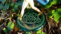
Her base narrowly avoids boring plastic disk territory by having a magical circle etched into the clear green disk.
Pros:
-
Gorgeous Pose
-
Dynamite body sculpted with an great eye for detail
Neutral:
-
Conflicting paint techniques
Cons:
-
Some more detailing on her legs would have made the figure even more incredible
So there you have it – another Alter Masterpiece as far as I’m concerned. Her pose and face really breathes life into her making her dynamic, but not quite so “IN YOUR FACE” as some other Alter sculpts tend to be. The slightly under-detailed legs and inconsistent paint techniques are minor annoyances, but she’s still absolutely gorgeous and I can’t really imagine asking for anything more of a Masou Shizuka figure.


21 replies on “Review: 1/8 Masou Shizuka”
I’d seen Masou Shizuka around, and while she looks nice and colourful she wasn’t eye catching enough to order I felt. Also interesting to hear she is from an eroge.
You’re photos look great. The natural sunlight really brings out the bright colours of her outfit well.
I like how her green body suit hugs her body tightly, looks really nice. It’s a shame her coat has less shading applied and looks a little bland. Her green base also looks quite cool.
Yea it seems like not many people picked her up…Sad really, but I can understand considering how obscure she is to most people in the West despite how long she’s been around.
Heh thanks…Struggled for a bit to figure out where to shot that wouldn’t look completely stupid with all those bright colors she has.
Yea that dress fits her like a glove! The coat is pretty much as bland as you see thats why theres only one shot of it as the focus haha…
Cute figure no doubt, but I really had to search for a picture from other angles. You have many from the one side, and I realize there’s not much to see on the far side, but even just looking for her navel was rather difficult given the angles provided. I just find it useful to provide a picture of things described to give a visual representation. I don’t always do it myself, but just constructive criticism. Regardless though, it’s a nice set.
I like how you’ve kept quite close to her for most shots allowing her to be the focus as she should be and not drawing too much attention to her surroundings. I never shoot outside because I’m never sure how to get the surroundings to be ignored as just filler or to scale, without blurring them too much into nothing. It’s too bad about her legs though, everything is laid out for them to be sexy, but like you say they lack definition and are rather bland.
She looks good for her age. (Her age in 1990 + 20 years)
Haha you and Chags are so similar in how you do things…
Don’t worry I have the same thoughts everytime I shot something, but I never seem to correct the problem…I start taking a few simple shots then I get really absorbed in it with 100 some dynamic shots and suddenly I think “Oh shit I need to shot the detail stuff right” and by then I’m tired so I just rattle off a few…Problem is half of them are bad lighting or blurred and…yea…
SO long story short Ash gets absorbed in shooting and then just fudges the detail shots…thus I am a lazy bastard…yes…
I actually had a few shots taken further back the problem was this place I shot at is actually a golf course and the stand of trees is no more then 20 or 30 feet deep and then its all roads houses etc etc and I got those in the far out shots or the lighting was bad so yea those all got scrapped.
You should still try it though! Walking out in the crisp early morning weather kneeling down in the slightly damp leaves with all sorts of bugs and nonsense crawling all over you…Its glorious I say! :p
I didn’t like the bugs when I did the outdoor shoot of Global’s Horo (A Rest in the Forest ver.).
WUSS!
Nah I only don’t mind it because nothing ever bites me it seems…Live in one of the biggest mosquitoes areas and not once a bite…Me thinks insects don’t like my taste or something…
I’m really tasty.
The post Masou takes is really something — having a good view of tits AND ass in one angle is fantastic. I’m also liking the gold trim that runs along the side of her dress, outlining her curves all the way down. Mmmmmmm~Needless to day, your set of photos is very handsome. The spot you picked for the shoot is perfect, and I’m amazed by how many different angles and lighting variations you pulled off with her. I’m pretty much the opposite when it comes to photography: I go nuts on the close-ups on the the various parts, but drag my feet HARD when it comes to getting creative. Hell, I’d be lucky if I could come up with 4-5 fancy shots for each review. I think you and I both need to adjust ourselves to a more moderate position between the two extremes.
Mmm Its rare to get both in one viewing angle and was one of the reasons I wanted her! I’m a big lover of the female physique as a whole so being able to see basically all of it sans her back was too good to pass up!
Heh I actually think the angles are mostly the same, but the lighting was pretty easy to diversify since I took this at sun-up so the natural lighting itself literally changed as I spent all the time shooting her…Its good to make mother nature do all the work for you! :p
Yea we probably should do an Amalgam of our two styles…I always worried about you always doing the same basic types of shoots that you’d get bored or something thought you might wanna spice it up or something…I dunno like the last person ever that should offer photography advice…But I’ll try next time to get more detail and full body shots in ahah. >_<
They did a good job to make the dress translucent. Great outdoor photography. How did you do to get the sunny blur effect?
Depends on the shot haha…Ummm some of them was just using the natural foliage as a diffuser and others was the magic of photoshop! >_>
Oh thx for sharing some infos about her origin.
As I saw preview pictures of her I first thought “wait in which episode of Code Geass did C.C use that outfit” Haha later I noticed that this figure has nothing to do with C.C .
The figure itself looks really nice, she has a lovely face with sharp green eyes
the witch outfit and the chosen colors of it are pretty,this short light green dress looks quite attractive.
The Location for your pictures is very well chosen,
the diffuse backlight looks awesome especially in picture P1010050 copy
Wow now that you mention it she does remind me slightly of C.C.
Mmm the face is always important to me and they did a bang up job here for sure.
Ah yea location always important…This one was a shallow stand of trees bordering a golf course. Its deep enough to give the illusion of a full forest, but you get the large open golf greens behind it that let in a nice amount of sunlight…Works perfectly!
Awesome photos.
The character design seems a bit odd to me, but I’m liking the way they did that skin-tight part. Being the perverse person that I am, I’m wondering what’s under the skirt area (if you could even call it that…) now.
Ah the chara design is pretty retro as our all of the older Rance characters pretty much…They look like if you took 80’s DND style and meshed it with Anime basically.
Under the skirt though is just a plain old pair of white panties…Not much for up-skirt shots and frankly she’s more alluring to me when you can’t see them. :p
I saw this for a reduced price on Amiami a while back and thought about picking her up. Without knowledge of the character I have only her looks to gauge the want factor. But there’s simply not enough love here for me.
I have to say I love the shots you took of her. In specific how you chose mostly brown backdrops (dried up leaves and logs) because it makes her green colour scheme stand out more and become the “life†of the shot.
I question the shading of her dress though. I’m pretty sure it doesn’t get that dark in the creases and curves with a tight dress. It may look good and help bring out the sexiness but it’s hardly correct. But then again I’ve never worn a tight dress…I swear!
Yea shes nice, but not really at the level that a non-fan would buy her I don’t think sadly.
Yea I kept struggling on how the heck you make someone with such bright primary colors look “Natural” ahah…
The shading really is pretty overblown…Funny how most figures don’t have barely any and Alter went apeshit here with it!
Blah, blah, innovative personality, powerful (overclothed) mage, blah. Not Menace, mu! Menace takes no backseat to this commoner!
I’m a little bothered by Masou’s color palette – luckily they’re softer colors, but of their own they’re very jarring. Green, blue, yellow, orange, magenta? I have no idea what the primary and secondary colors are, but that sounded like most of them. I’m not very well-read on green hime-cuts of the past, but as of now she’s looking a tad generic. Because green hime-cuts go hand-in-hand with blue sorcerer’s wear.
Okay, I’m really just being butthurt about Menace not being in her place, attacking Masou-san like this. She’s got a dynamic pose with that guruu guruu going on, I’ll give her that. Magnetic hat is a nice touch; an innovation that definitely needs to be propagated, with how crazy figure accessories are getting. I mean, slipping this here and getting this to stay there can be mighty troublesome. Busou Shinki can really learn something from that; Altlene took me a good hour to piece together. The base looks pretty decent too.
What it seems though is that she’s a bit past her prime – we the commenters at least don’t know her very well. I can’t say though that there doesn’t exist emotional attachments to her from a decade or two ago, but without them she can only be a good sculpt.
At any rate, awesome job taking HH outside. Ol’ Chag can prolly use some of that. Great choice of backdrop; the softer browns really help with the duller shades of her costume, making them less jarring to look at. Especially cool when you reflect some of that morning glory off of her. I mean the pretty light.
Looks like Sloth up there isn’t going to admit he took the P3P Mshe route to the next level.
Haha I know I know…I have absurdly specific conditions on what I want the weather to be for Menace so she keeps getting delayed… >_<
But yea I can't hardly say I'm suprised noone seems to know who Masou is what with the combination of her age and the fact that the only Rance game thats been translated only features her very briefly. Still awesome character just love her.
Haha yea like Chags said earlier we should merge our two styles…His clean reviewish shots and my…errr…erratic outdoor nonsense?
Alter doesn’t have the biggest rep for doing risque figures, but damn if they don’t know how to sculpt a nice ass. I’d really like it if they kept on making Rance figures, which I guess means Sengoku Rance figures, these days. Hibachi and Ryouma would be nice, as would Kenshin, since the world never has enough Kenshin figures.
Very nice pictures, I’m also thinking about taking my camera outside sometime soon, since it’s getting cold and all the leaves are gonna be falling down really soon.
Alter should make a sub-brand for Ero stuff like Max did…Now how epic would that be? (Hopefully not exclusive though…)
That I would like to see though…Only managed to cajole Aka into doing one outdoor shoot…Granted outdoors isn’t always the solution (Have a figure right now that has that problem…), but I find it the most fun!