As I had mentioned in my last post, I had gone through all of my photos recently. The one harsh conclusion that came out of this undertaking was that I didn’t have a clue when it came to editing my photos for much of the past seven years.
Under the mistaken assumption that I knew what I was talking about, I made a video on the subject of post-processing a few years ago. Today I can’t even bear to watch it again, because I know it placed embarrassingly disproportionate emphasis on a small number of adjustments, utilizing very few of the available tools. Thankfully, I’ve pieced together a more coherent editing process since then, mostly through trial and error plus the occasional YouTube video. It has taken me far too long to learn so little, and I really wish I had made an effort to learn more about this subject earlier on.
All this dreary talk brings me to the purpose of this post: just because I took ages to get a clue doesn’t mean you have to! This tutorial is meant to be a starting point for anyone looking to get into post-processing in Adobe Lightroom (or any similar photo-processing application). I will go through all of the common adjustments and then briefly explain the purpose of each. By the end of this post, you will have a better understanding of the various options available to enhance your image!
Laying the foundations
When editing images, raw files are much better than jpeg files. While a jpeg file will usually look better than a raw file straight out of a camera (because the camera applies basic processing to jpegs), a raw file is greatly more flexible for editing. Unless you need to share your photos immediately on the internet, just shoot raw.
Before you get started on anything, there are a couple of base adjustments to get out of the way.
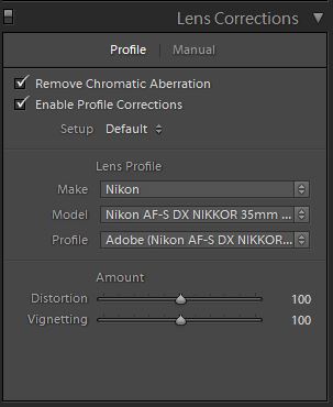
Lens corrections: Use the lens corrections tool to remove chromatic aberration and enable lens profile corrections. This corrects the distortions and vignetting from your lens, which can make a significant difference in the lower-end options, especially zoom lenses. Lightroom should apply the correct lens profile automatically when you enable this option. In the case of my Canon G5X point-and-shoot camera, the corrections are applied by default.
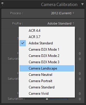
Choose the camera calibration profile: This depends on your camera, but they typically include profiles such as landscape, neutral, portrait, vivid, etc. Go through the available profiles in the drop down menu and see which one suits your image the best.
Correct mistakes
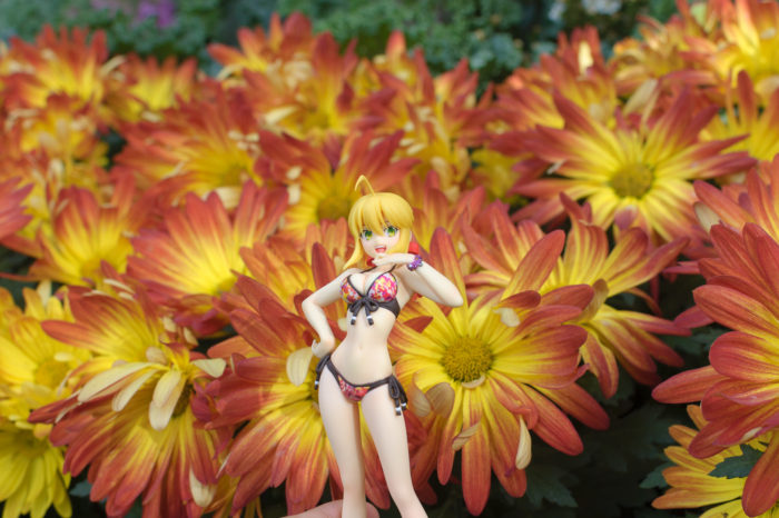
In the perfect world, every shot you take has perfect composition, white balance and exposure. But here are some adjustments for when reality falls short of expectations.
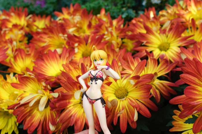
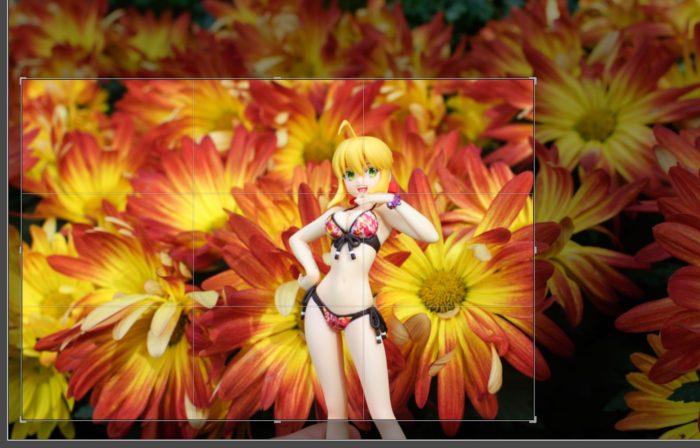
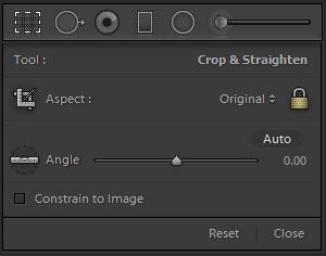
Crop & straighten: Re-crop the image to improve composition and/or straighten as needed. In the example above, a basic rule of thirds composition makes the image more interesting at the expense of a lot of resolution. Needless to say, try to get your framing right when you take the shot to avoid this step.
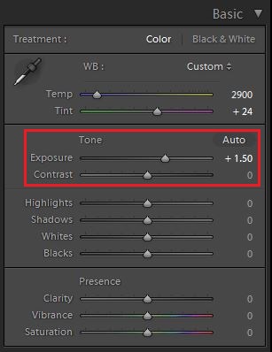
Exposure slider: Adjust exposure if obviously under or over-exposed. Raw files can be amazingly forgiving, but boosting the exposure will produce extra noise.
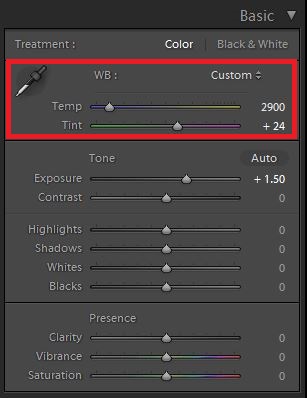
White balance: If your image has an unnatural colour tint, chances are that the white balance was not set correctly. Pick from the presets or tweak the sliders until the image looks right. You can also use the white balance selector tool to set a neutral point on the image to set the white balance.
- White balance can also be used creatively. If you want an image to look warmer or cooler, use the white balance sliders to your advantage.
Enhancing Tone
Tonal adjustments are the most important part of any editing process. Typically you want your image to have a healthy tonal range that stretches from the brightest highlights to the darkest shadows. This ensures your image does not appear flat or washed out.
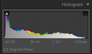
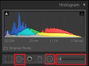
The tonal range is represented visually on the histogram. The left end of the histogram represents the darkest end of the tonal range, while the right side represents the brightest.
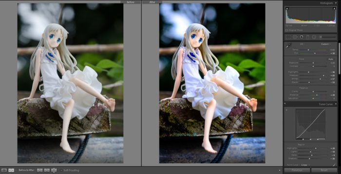
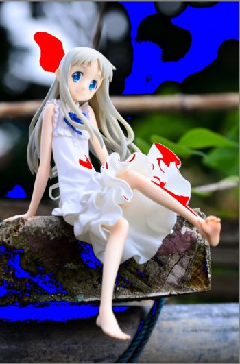
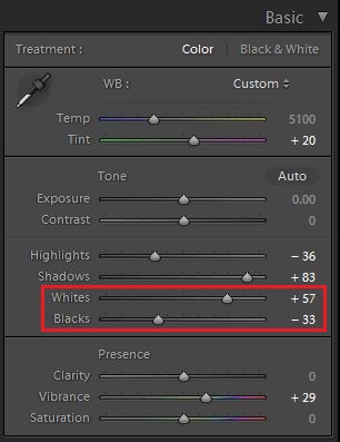
Whites and blacks sliders: The first order of business is to fill up the tonal range by boosting the brightest parts of the image and dimming the darkest parts. Under basic adjustments, increase the whites and decrease the blacks. My rule of thumb is to bump up the whites until a small part of the subject is overexposed (white clipping), and decrease the blacks until a desired portion of the image is underexposed (black clipping).
- Clipping represents the point at which details are lost in the image. Press “J” to toggle clipping indicators on and off.
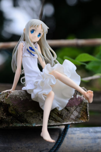
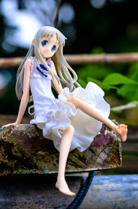
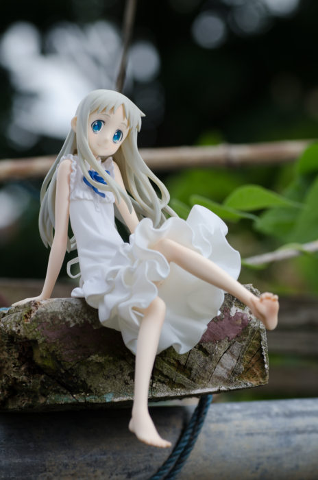
- Consider what is important in your image and don’t be too afraid of a bit of clipping. In the example above, the focal point of the image is the figure, not the background. Therefore as long as the figure looks better, losing a bit of detail in the background is worth the trade-off!
- Because of the way the figure was lit, the parts of the skirt and leg closer to the light source are brighter. Consequently, these portions of the image are over-exposed after boosting the whites. Since the face is the the most important part of the image, the priority is to make sure it has the right brightness, even at the expense of the details on the skirt and leg. This blown out portion of the image is a bit distracting, but we will revisit the this at the end.
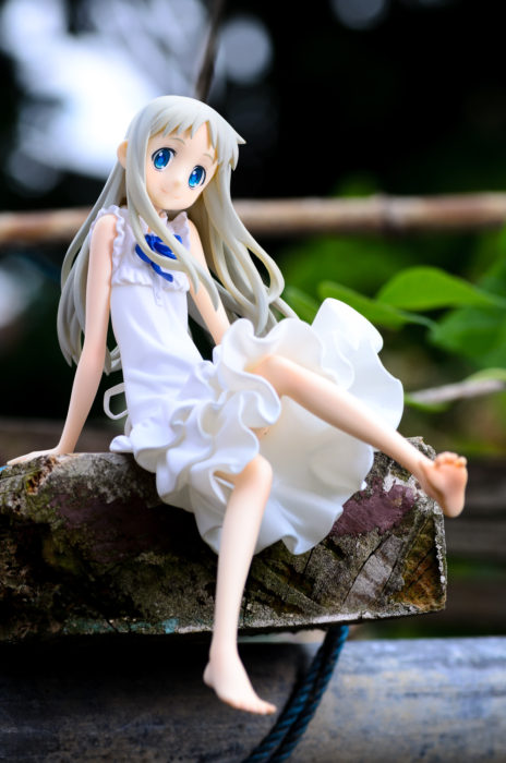
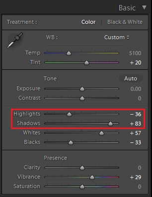
Highlights and shadows sliders: The next step is to adjust the mid-tones. Moving right above the whites and blacks sliders, adjust highlights and shadows sliders. I felt the contrast looked a little unnatural after the initial tone adjustments in the example above, so I bumped up the shadows and reduced the highlights to flatten out the tones slightly.
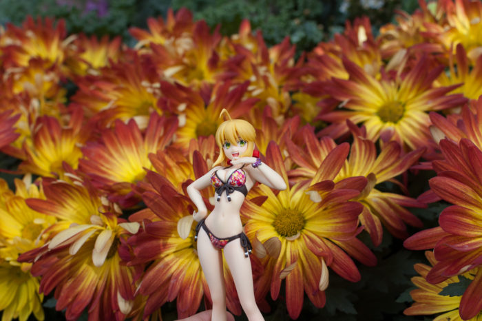
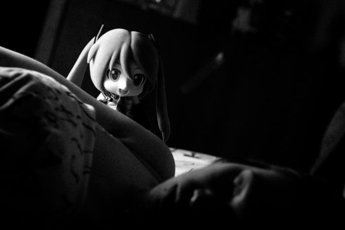
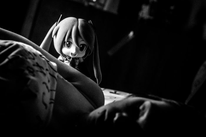
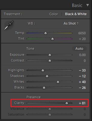
Clarity slider: Try this to see if it enhances the image. Clarity affects the contrast in the image’s mid-tones and is different from the contrast slider. In practice, it bring out small details and textures. Bumping up the clarity can make an image more striking, but it also tends to make the image look unnatural, especially when used liberally. The picture below is a rather extreme example with clarity cranked up to +81.
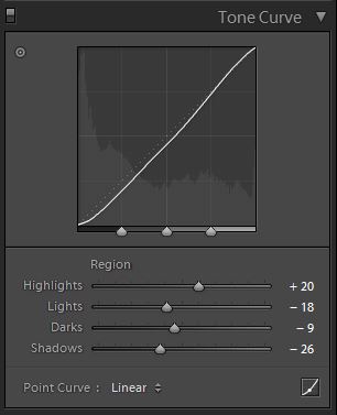
Tone curve: Experiment with the tone curve tool. This is similar to the basic tonal adjustments discussed above, but playing around with the sliders here is a good way to fine-tune the tonal adjustments on your image.
- The tone curve is a bit more flexible than the basic tone adjustments. You use the pointer tool by selecting a point on the photo and dragging it up or down to adjust the tone in which your selected point occupies. You can also drag on the curve itself.
Colour Adjustments
People are naturally drawn to vivid colours, so it makes sense to enhance the colours where appropriate. Consider the mood of your image; if your subject is some sort of idol girl figure that looks like she just walked out of a parade, it’s probably a safe bet to crank up the colours on it. Conversely, if your subject is something more solemn and moody, tuning down the colours might suit the image better.
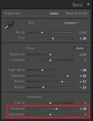
Vibrance and saturation: Adjust the vibrance and saturation sliders under basic adjustments to make global adjustments on colour. The saturation slider boosts all colours, whereas the vibrance slider leaves the already saturated colours alone while selectively boosting the other less prominent colours.
Selective colour saturation adjustment: Use the sliders under the saturation section of the HSL tools to tweak the saturation values of specific colours. Emphasize the colours you want to bring out and mute distracting colours. In the example above, I decided to boost the blue saturation to bring out the colour of Menma’s eyes, as well the the blue tint on her dress and on the pipe below her, which I feel compliments the green in the background.
Final touches
Once you’re done swinging the sledgehammer that is the global tone and colour adjustments, it’s time to break out the chisel for the final touches.
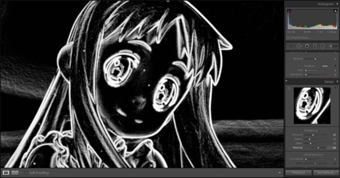
Sharpening: It’s always good to apply some sharpening to the image, although the difference may not be all that noticeable when viewed on the web. After adding the desired amount of sharpening, make sure to use the masking slider to limit the sharpening to the lines you want to sharpen.
- While adjusting the masking slider, hold the Alt key to see the sharpened areas. Push the slider right until you see a clean outline of your subject — this limits the sharpening affect to where you need it the most
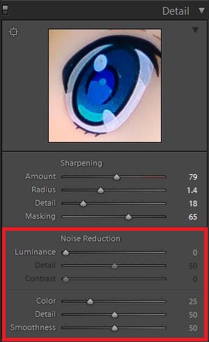
Noise reduction: If you shot the photo at high ISO settings or applied extensive exposure and tonal adjustments, applying noise reduction will reduce visible noise.
- Keep in mind that even a small amount can have a negative impact on overall sharpness, so use sparingly.
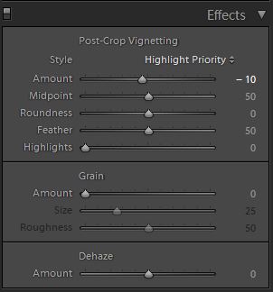
Post-crop vignetting: It may seem counter-intuitive to remove vignetting in the beginning, only to add some fake vignetting in the end. However, you have a lot more control over how the vignetting looks here. Vignetting is a simple way to force the viewer’s attention to the centre of the image. This adjustment is easily abused and not every image needs it, but it comes in handy very often.
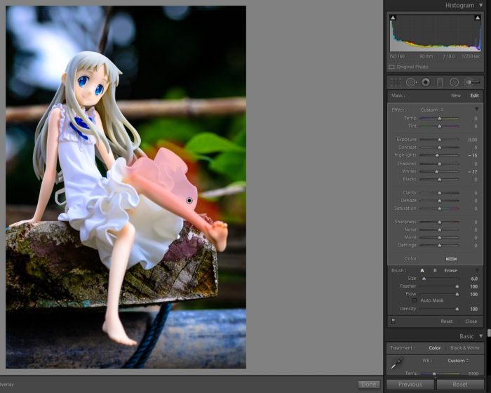
Apply local adjustments (spot removal, radial filters, adjust brush, etc.) as needed: In the example above, I applied an adjustment brush that lowers the whites and highlights on the over-exposed portions of the skirt and leg to make this portion of the image less distracting. I also used spot removal to get rid of a speck of black dust under her thigh.
- The spot removal tool copies another part of your image to cover up a selected area of your choosing – kind of like a hair transplant to cover up a bald spot.
- The adjustment brush and the radial filter can apply all of the settings I mentioned above onto a specific part of the image. The former works like a brush tool, whereas the latter applies the changes to the entire image outside of a set elliptical shape.
- These spot adjustments can be used for much more than fixing the odd problem here and there. You can use them to completely change the look of the image. For some tutorials on the extensive use of these tools, check out YuriFineart YouTube channel.
Go Beyond
This has been a breakdown of a fairly basic editing process in Lightroom, but it really is only the tip of the iceberg. For example, Adobe Lightroom is a powerful tool, but it is often only the starting point of post-processing workflows. More experienced photographers would often take the processed image from Lightroom and feed it through optional add-ons and Photoshop to further enhance the image. You will find that some of the features (like sharpening) is more powerful on other software such as Photoshop.
Just like everything else about photography (or life in general, for that matter), there’s always more to learn about post-processing. Every image is different and there’s no magical preset that will suit every single image. Instead, it is important to understand each step of the process. This way you can edit to suit your image’s specific needs and discover new methods and techniques that cater to your own style. The wealth of free resources on the internet is staggering, and if you have any vested interest in improving your photos, it would be foolish to not take advantage of this.
As for me, I’m sure I will find the process detailed in this post to be inadequate once again after a few years, but the thought process here should still hold true: identify what your image needs and use the various tools at your disposal to enhance its strengths and cover up its weaknesses. With time, effort and a willingness to learn, your image will go as far as you can take it.
















2 replies on “Tips & Tricks: Basic Post-Processing in Adobe Lightroom”
That’s a great post!
This is the post I’ll direct people to in the future when they’re asking about what you can do in light room.
Learned some new tricks from it ;P
Great tutorial! We need more of these to help aspiring figure photographers!
One of the tools I use all the time is the H/S/L adjustment, so you can selectively control how certain color ranges are rendered. Photoshop’s version of this is NOT intuitive at all but it’s not too bad in Lightroom.