A few weeks ago, I came across some small potion-like glass bottles at a packaging store. I picked them up in hopes of incorporating them into a photo with Tharja. At the time, I remembered Tharja as a characer who’s obsessed with making potions, but since then I’ve realized that I completely mixed her up with Suzy from Little Witch Academia — oops.
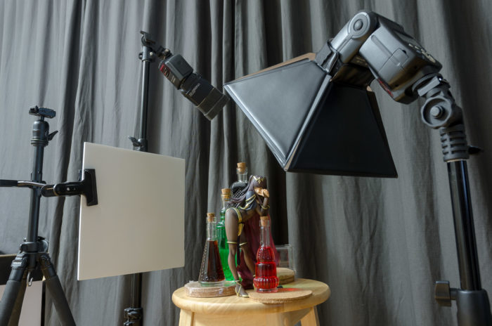
My poor memories of the character aside, I want to talk a bit about photo. The figure was set on top of my stool with a softbox flash as key light, foamcore board reflector as fill, and a flash with a grid and red gel on it as a spotlight on the curtain backdrop. Here are some of the thought processes behind the shot.
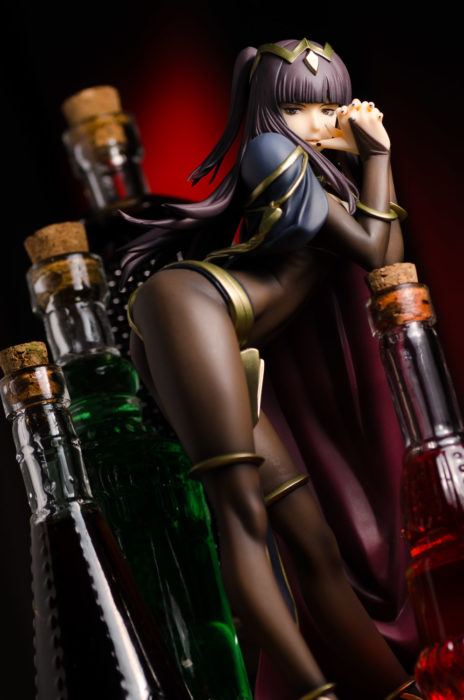
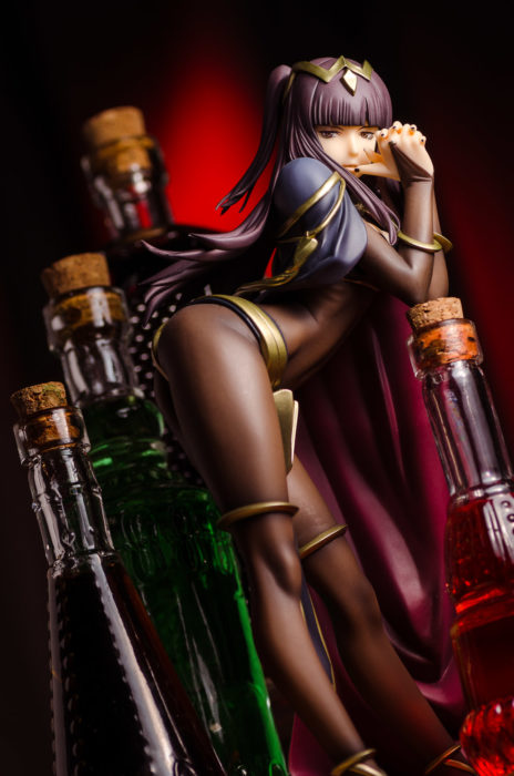
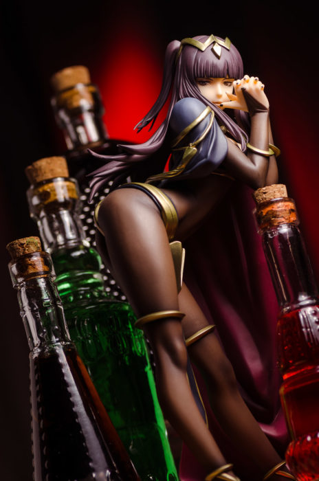
There are two main reasons for use of the Dutch angle. The first is purely practical: to fit Tharja’s pose into the composition. Because her legs are such an important part of the figure’s appeal, I feel compelled to use a portrait orientation frame in order to show them off the legs as much as possible. However, because Tharja leans so heavily to one side, her head tends to be squished to the edge of the frame when shot at a straight angle. By shooting with a crooked angle, I am able to place the away from the margins of the frame. I do this very often with my closeup shots, but the crookedness is very noticeable here because of the parallel lines from the bottles.
The second reason for the dutch angle is a bit more creative. Because of the unnatural tilt, Dutch angles tend to convey a sense of falling, which brings about a sense of unease. Furthermore, because of the low angle, the viewer is positioned below Tharja. The downward gaze, the crooked angle, as well as the red spotlight on the backdrop all give the shot a bit of dramatic tension that enhances the shot, thus justifying the slightly disorienting camera angle.
The original shot was shot with the key light placed directly to the right of the figure. However, when I consulted Miette-chan for feedback, he suggested to “maybe lower the intensity on Tharja, she is a creepy stalker after all”. This reminded me that the character in the game always had shadows over her eyes, which prompted me to raise the key light higher to angle down on the figure at a 45 degree angle. This cast a shadow over the figure’s eyes, and though I usually avoid this at all costs, this added to the menacing feel of the character.
Finally, it is also at this stage of the editing process that I decided to switch the shot to black and white. This is mostly because I felt the colours did little to enhance the mood of the photo. While I was happy with the red spotlight backdrop, there are a lot of clashing colours between the backdrop, the figure and the food colouring in the bottles. On top of that, the bottles also have visible white glare from the soft box on my key light. By switching to black and white, the glare is a little less noticeable.
For me, the takeaway from this shot is to always try to get feedback. I admit this is not something I do as often as I should, but it made an enormous difference for this shot. Trusted feedback is a valuable resource that ought to be utilized if one aims to improve at anything in life, and photography is certainly no exception.


